
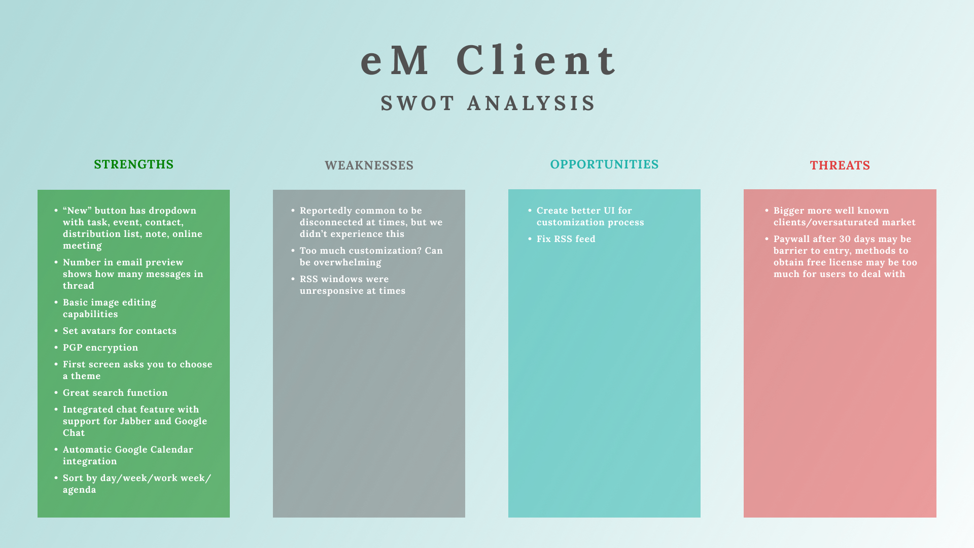
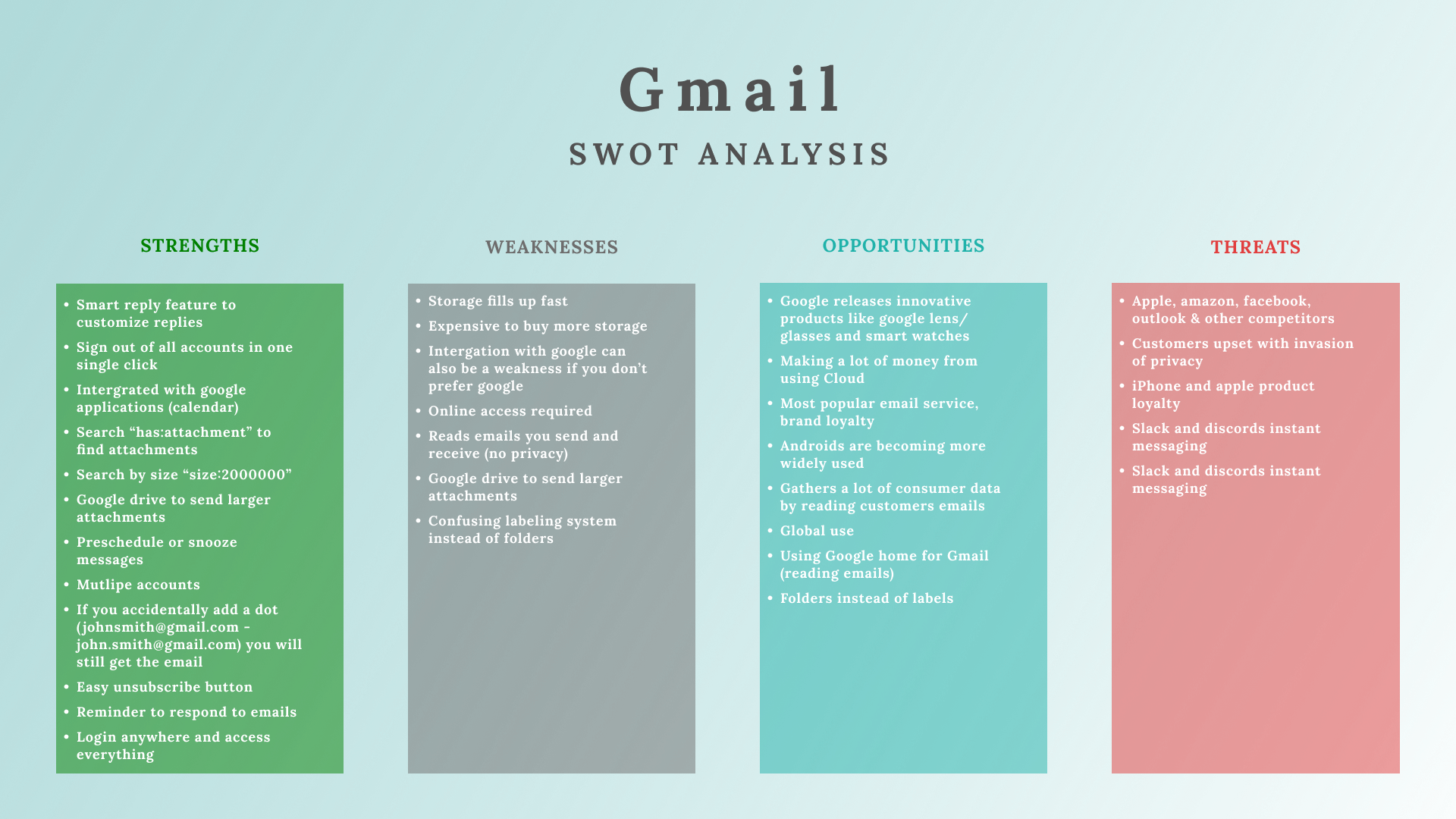
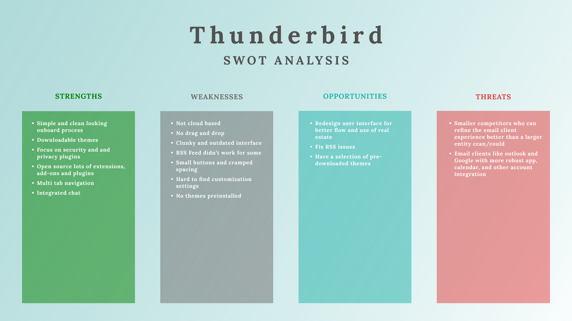
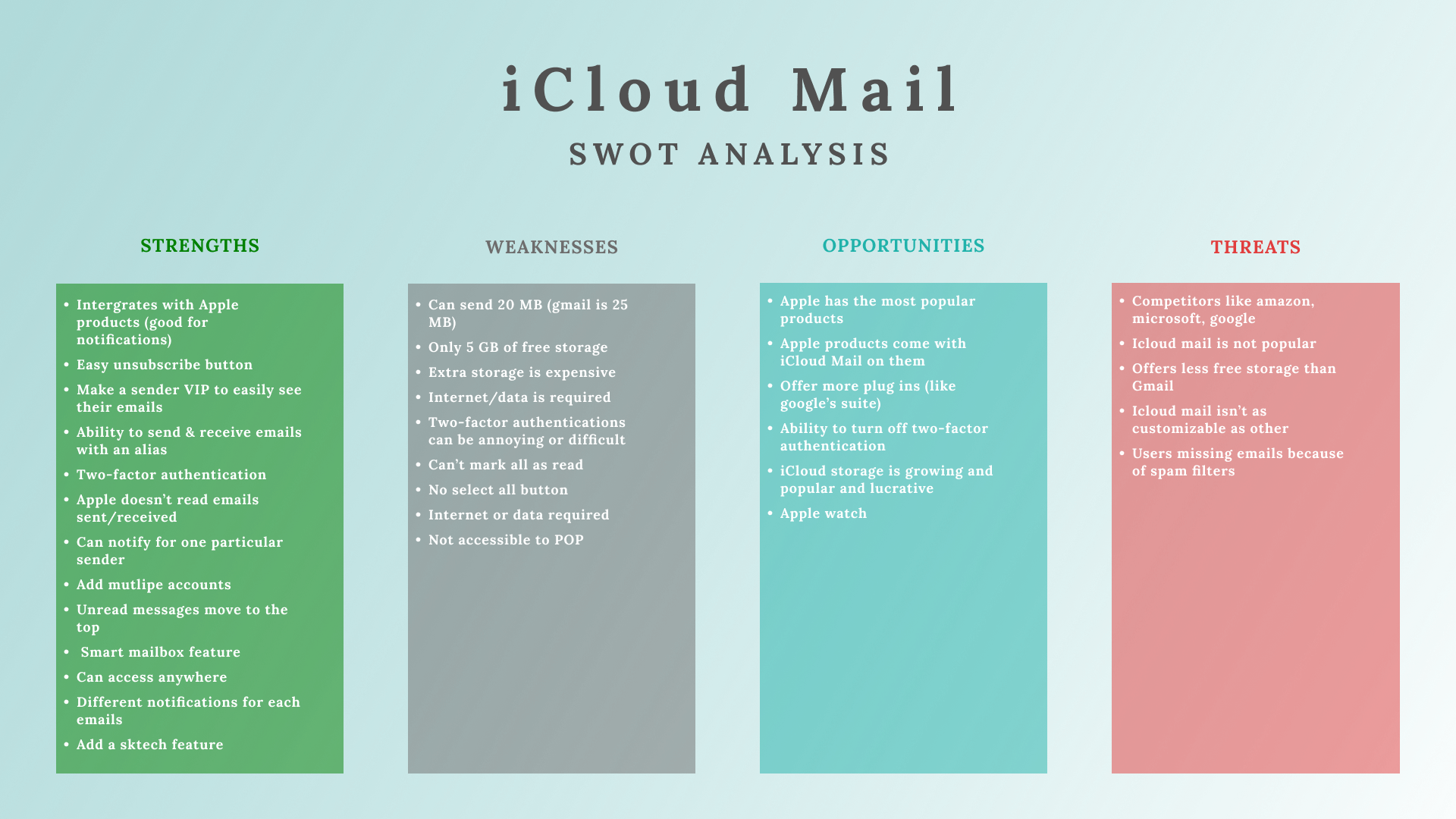
SWOT Analysis of Email Clients: eM Client, Gmail, Spark, Airmail, Thunderbird, iCloud


Redesigning Microinteractions: IOS & Android Weather App


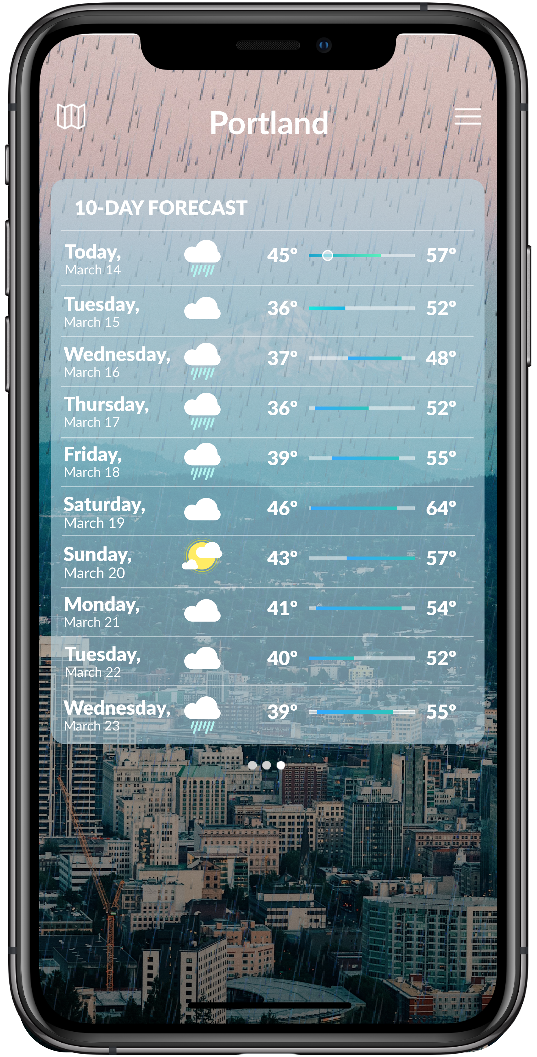
Weather App Prototype
Microinteractions: Chapter 4 & 5 Feedback, Loops, and Modes
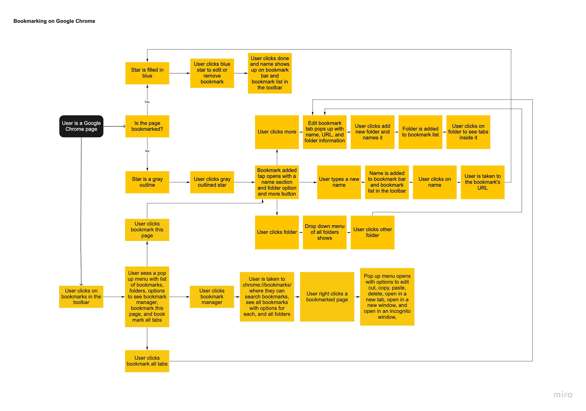
Feedback for bookmarking a page on Google Chrome- Once the bookmark star button is pushed the star turns blue. Bookmark then shows up in the list of bookmarks. This is very subtle but necessary feedback, I don’t find it extremely delightful but it is useful and appropriate. I think anything more, like an earcone or message would be too much. The star being filled blue is enough to get the message across without annoying the user.
Feedback for screen-recording on an iPhone- Once button is pressed, the button begins a 3 second countdown and at 3 seconds it turns to flashing red, if you leave the screen there is a red flashing icon in the corner of every screen showing you that the screen is still being recorded. At the end of the microinteraction, when the flashing button is pressed, an message pops up on the screening saying the recording is saved to photos. The first time I ever screen recorded on my phone I wasn’t sure I was even doing it. Now that I know what the buttons look like and mean I understand but I think there is a better way to tell users that the microinteraction is happening. Instead of a countdown on the button, I think an alert with text saying screen recording begins in 3 seconds, and then a count down starts. Similar to the end of the microinteraction when a message tells users where to find the recording,
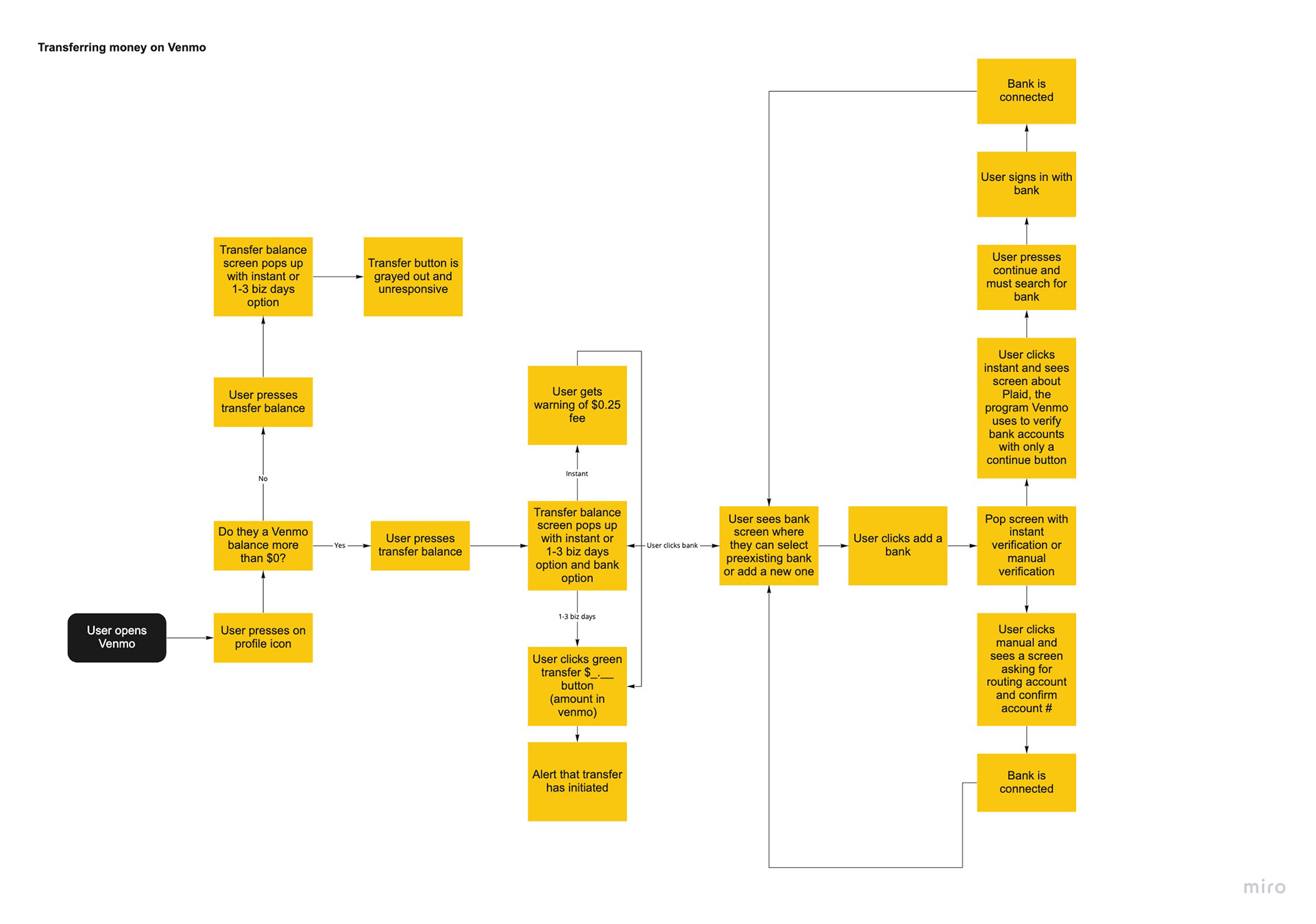
Feedback for transferring funds to a bank on Venmo- Blue button with “transfer balance” text written on it is pressed, new screen opens up for bank selection, green transfer button is pressed, alert pops up with a small check animation with text saying that transfer has been initiated. Green button then turns gray. There is a lot of feedback in this microinteraction, with many messages. I find this appropriate because this interaction has to do with money which people need and want to be more careful with and want more information on. Each button reveals a new screen with messages describing what is going on in the background. This is not delightful but necessary. One thing that could make this interaction more delightful would be a haptic or earcone for then money is being transferred. The check mark animation is a little boring but it could be more fun with a pleasant sound with it.
A mode that can be found in my microinteraction examples is when you are transferring your money on Venmo. On the scene you see when you press the transfer button, there is a section to change the bank the money goes to. Clicking on this will take you away from the transfer screen to an “add a new bank” screen, which will need bank information and log in. This mode has it’s own screen which is good practice, according to the book. I agree, it makes the process smoother and less confusing. I don’t think it can be avoided because users need to be able to change the bank the money enters and the best way to do that is to choose the bank when the money is being transferred. Venmo uses your default bank, so it doesn’t ask you every time you transfer money which I think is very important. A user can change it if they want to, this is similar to the weather app; It will give you the weather on your default location but if you want to change the default you need to manually add the bank, like you would add the location on the weather app.
Microinteraction Flowcharts (click to enlarge)

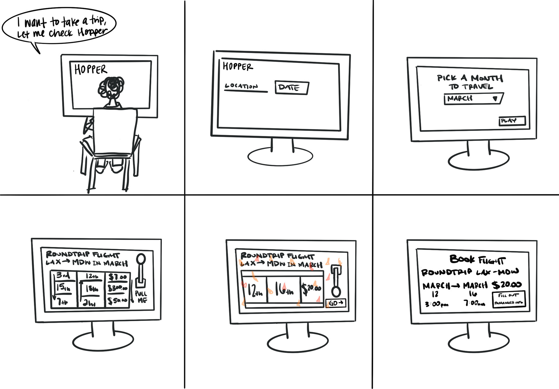
Recontextualizing Microinteractions: Christina Strok & I reimagined choosing travel dates on Hopper as a slot machine game and through Alexa

Microinteractions: Chapter 1 & 2
"This is what experience design truly is: paying attention to the details as well as the big picture so that users have a great experience using the product."
This chapter made me really think about the way I approach projects. I tend to go in thinking about only the big picture, how I can make a difference or create something new and bold. I don't end up thinking about the details until well into my project and research. After this reading, I want to change this. The way I was approaching feels more self oriented than designing for the user. Those small details can make or break the overall design and can make something so ordinary into something that can make users life easier. The iPod was referenced many times in the reading and I think this is a great example. It's very simple, its only purpose is to play music. There were many other devices that could do this but the iPod paid attention to the details. Making it small enough to fit in your pocket, offering a screen to show songs and a wheel that is intuitive and I would even say fun to scroll.
"Of course, some features are so useful and/or powerful (or so highly protected by intellectual property laws) that the microinteractions don’t matter as much."
I never thought about it, but it makes so much sense that competitive markets push microinteractions to be more functional and better designed. Especially when users have a tendency to blame themselves when they make a mistake because a product wasn't intuitive to them. Users don't know how much easier something can be until it's given to them. Using a product with innovative technology that you've never seen before will make you pay less attention to the details that might not be the best user experience. Thats when companies take that technology and make something beautiful with it, that will give the users a much better experience. For example, the text talked about the how the copy and paste keys came to be. With computers being new and complicated, users were going through many steps and modes to be able to copy, Larry Tesler knew there was an easier way and developed it in Gypsy. He changed the way we type forever.
"Invisible controls allow for an emphasis on what is visible, and creates a hierarchy of what’s important."
Invisible controls are particularly interesting to me, because I never think about them. They make my life so much easier but I never even notice them. Automatic toilet flushing and bathroom sinks turning on so I don't have to touch germ infested controls, or my Google Home always listening for me to ask it a question. It makes life feel effortless! When it comes to my Google Home there is only one visible control– on/off switch for voice listening. This puts emphasis on how important users find the ability to turn off the listening is. Privacy is so important and having a device constantly listening to users can make them feel like their privacy is being violated. Making that switch the only one on the entire device will help make users feel like their privacy is important. There are loads of other invisible triggers Google Home offers; You can ask for the weather, set an alarm, play music, and so many more. There are also invisible touch triggers on the top of the Google Home, tapping the top will play/pause/stop music, alarms, and phone calls, left/right taps control the volume.