
Based off user research and surveys I redesigned Airberlin's inflight entertainment system to be a better experience for their users needs and wants.
Creator:
Audra Walker
My Role
User Research & Surveys, Competitive Analysis, Wireframing, UX/UI Design, Concept Design. & Prototyping
Problem
Inflight entertainment systems have been lacking, and an update is long overdue.
Insight
Through user surveys I learned that passengers are mainly frustrated with how complicated and slow the system can be. Users wanted the ability to connect their device, stream music on-board, and a good selection of movies.
Solution
An easy to use and navigate entertainment system that lets you log in to your Spotify, order food, drinks, or items on Skymall with Apple Pay, see flight information, watch movies, view airport and city guides about your destination, and book Airbnbs.
Design Challenge
How can I make a better in-flight entertainment
experience for passengers?
experience for passengers?
Research
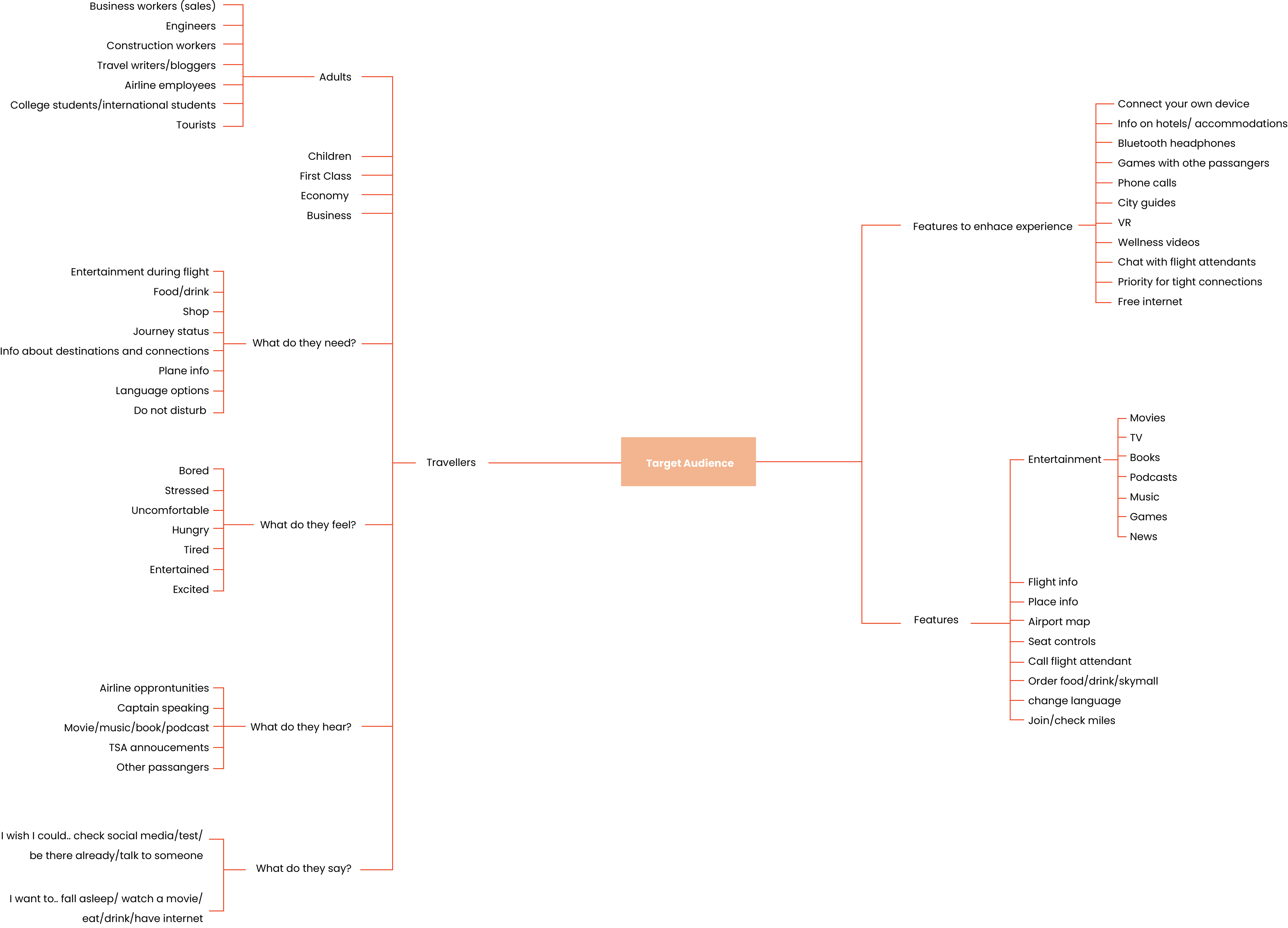
Mind Map
The first step mapping out who my target audience was. I made a mind map and broken the target audience into categories of different flyers. Then, what the audience needs, feels, hears and sees during their flight experience.
Based off that information, I created features that you should normally find on a flight and features that would enhance the users experience.
Connecting your own device and chatting to the flight attendant sounded very interesting to me.
Mind Map
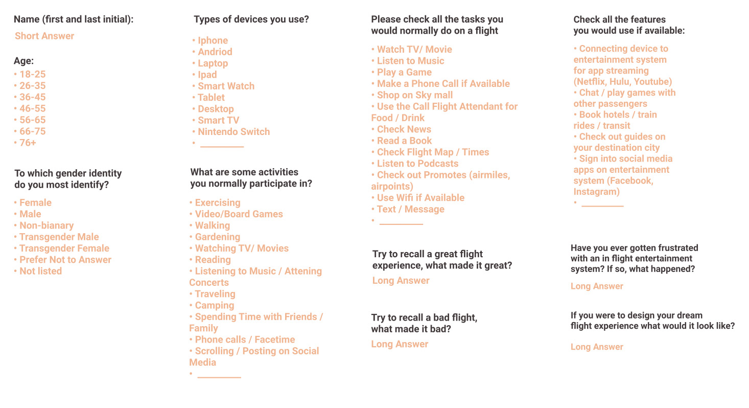
User Survey Questions
User Survey
Next, I created my user survey. In these questions, I first wanted to learn about the user.
Then, I asked about their flight experiences and what typical actives they do on a flight. I wanted to see what features are important and if any are obsolete.
Lastly, I wanted to give the user a more creative lens- I asked them to describe their dream flight.
User Survey Responses
I received a total of 28 responses from frequent flyers, ages 18 to 65. Many of the frustrations had to do with the system being too complicated and slow and the headphone jack not working.
Most of the great experience responses included a good selection of movies and free services.
The dream flight question did not go as planned, the responders mainly commented on parts of the flight experience that the entertainment system is not related to. They wished for more space and quicker flight times.
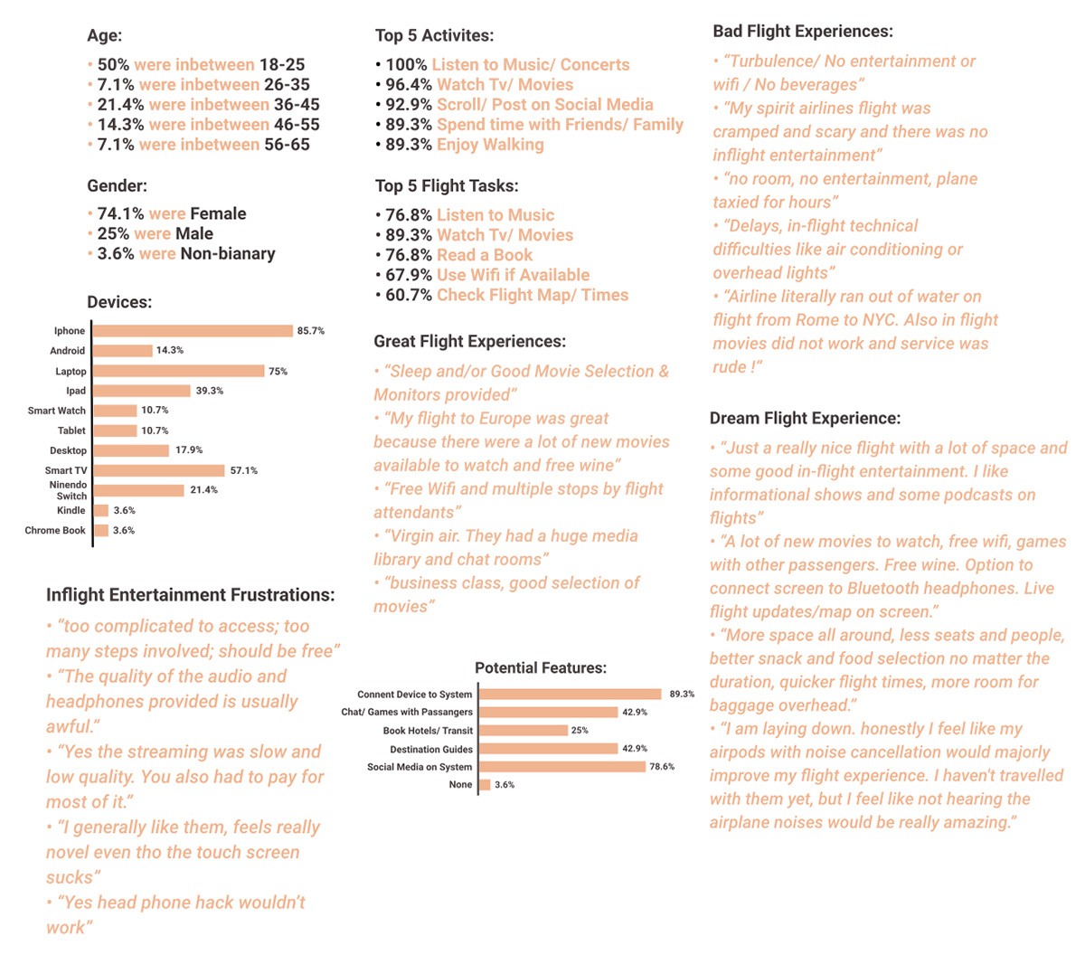
User Survey Responses
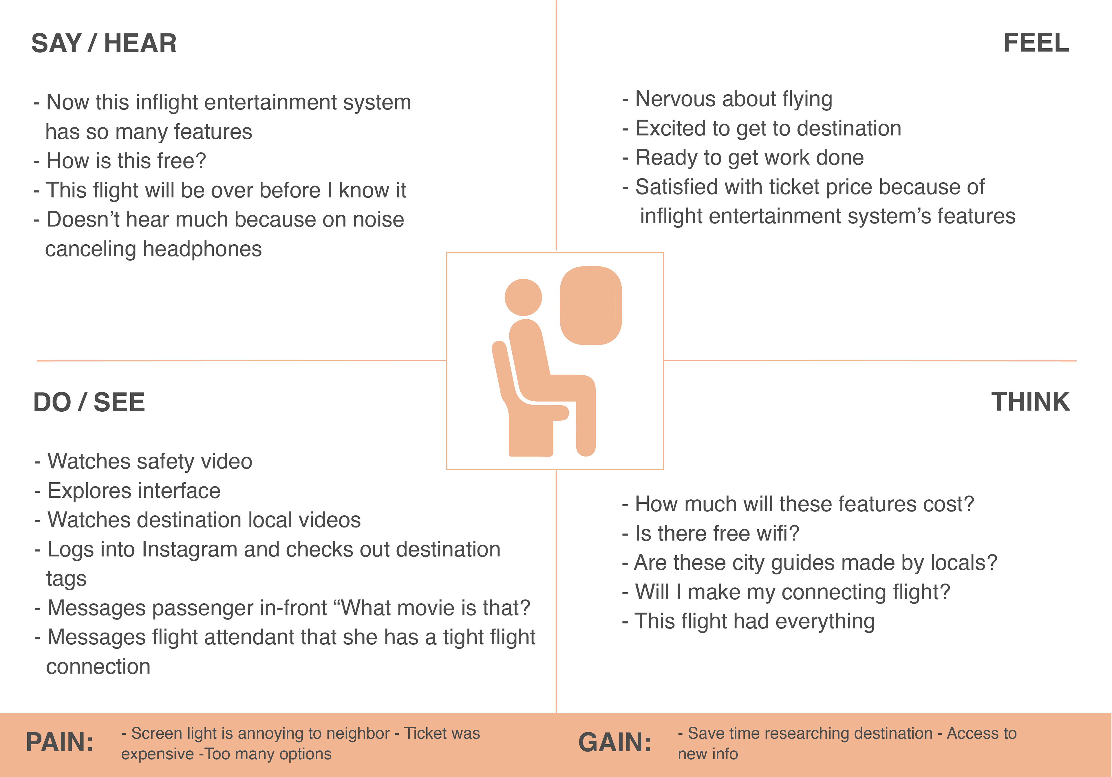
Empathy Map
Empathy Map
Based off the mind map and user research, I designed the empathy map. It explores what the user will say, hear, do, see, feel and think.
It also shows overall pains and gains during the experience. One of the biggest pains is the ticket price; but all the features in the inflight entertainment system will make up for the cost.
User Persona
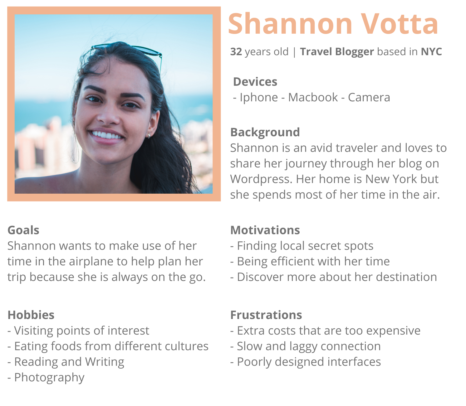
Meet Shannon
In my mind map, one of the frequent flyer occupations was a travel blogger. I decided to make a persona card using that for Shannon. She also shares many qualities with the users who responded to my user survey.
Her main goal while traveling is to work on her blog and plan her trip. She cares about saving money and being efficient with her time.
"I'm always moving, I want to to be able to plan my trip while I'm flying to my next destination!"
User Persona
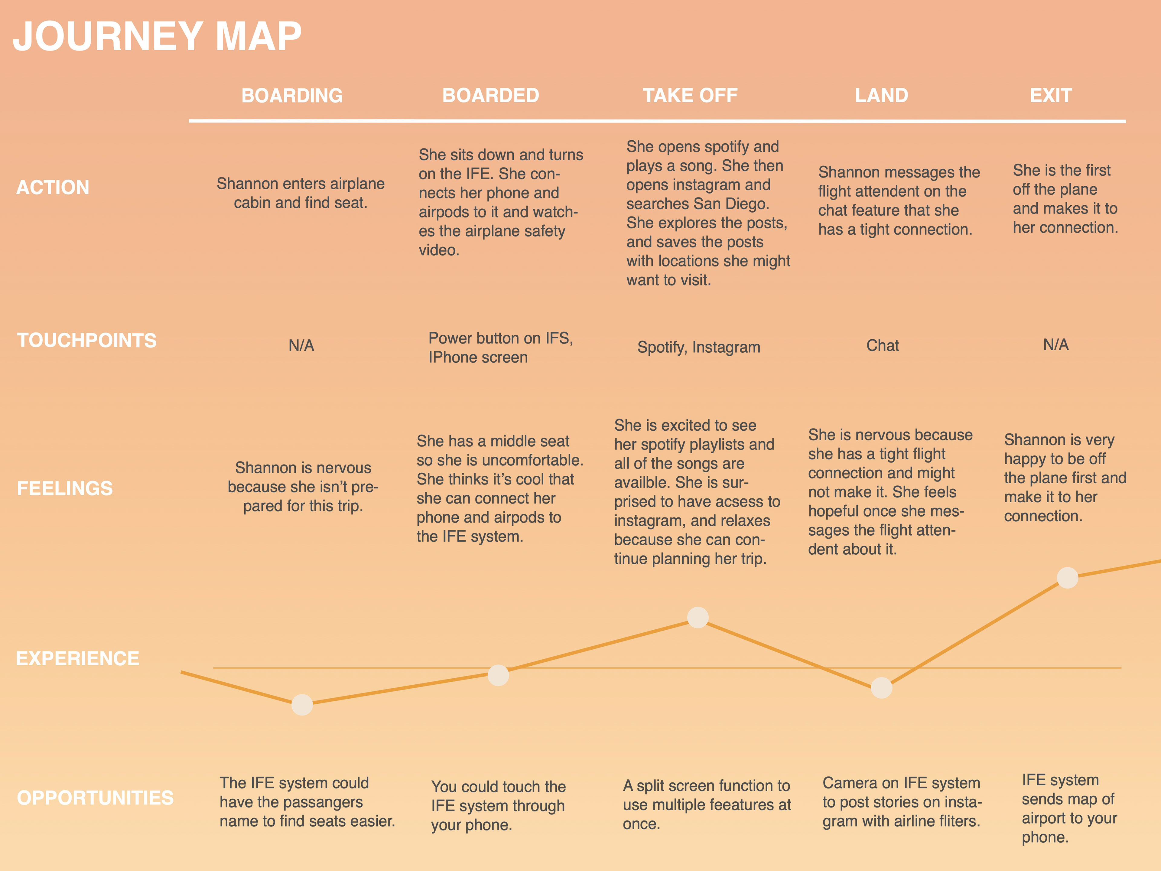
Journey Map
Journey Map
In Shannon’s journey map I found apps in the system to be very important to her, such as instagram.
Shannon’s connecting flight was also a big stress factor during her journey. She was able to chat the flight attendant about the tight connection, get off first, and make it to the gate. This feature could make a huge difference in a user’s experience. Although, I decided not focus on it in my prototype because I found other features to be more important for my user persona and from my user research.
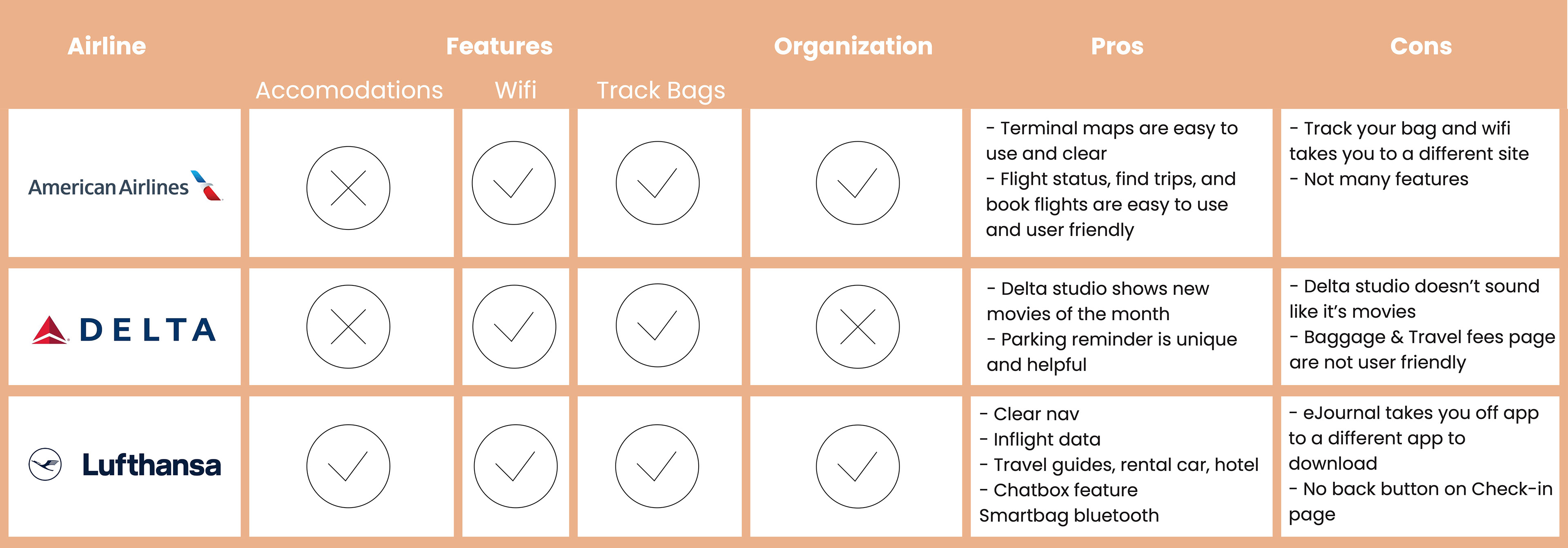
Competitive Analysis
After deconstructing airline apps, I found the most important features were wifi, bag track, and accommodations (car rentals and hotels). Organization of the app made the experience exponentially better.
Prototyping
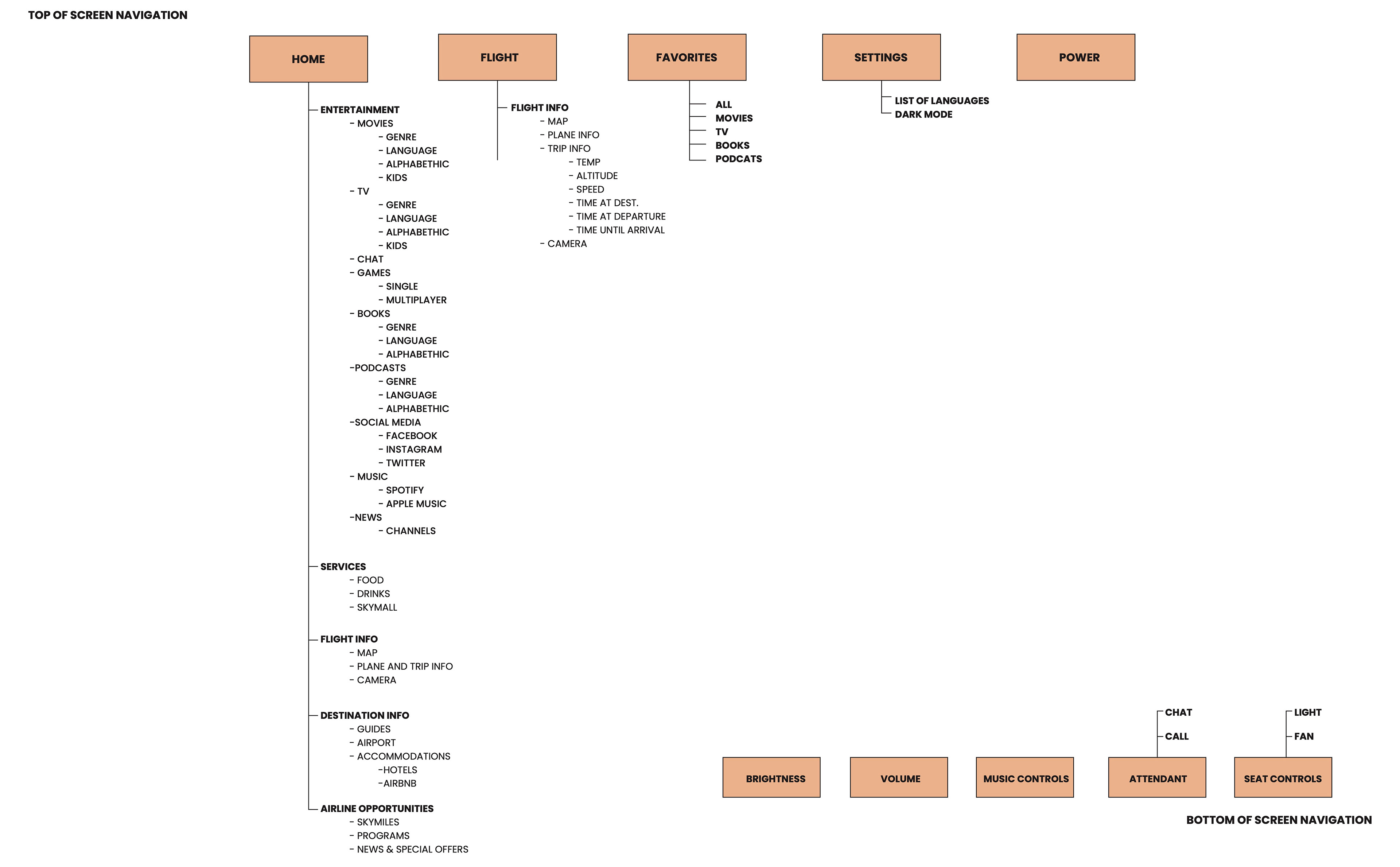
UI Flowchart
The flowchart is broken into two nav bars- the top is holding the main features and apps and the bottom is used for controls for the system and seat.
The entertainment section was very difficult. In the beginning stages I had all of the features by themselves without an entertainment category. This made the dashboard disorganized and overwhelming.
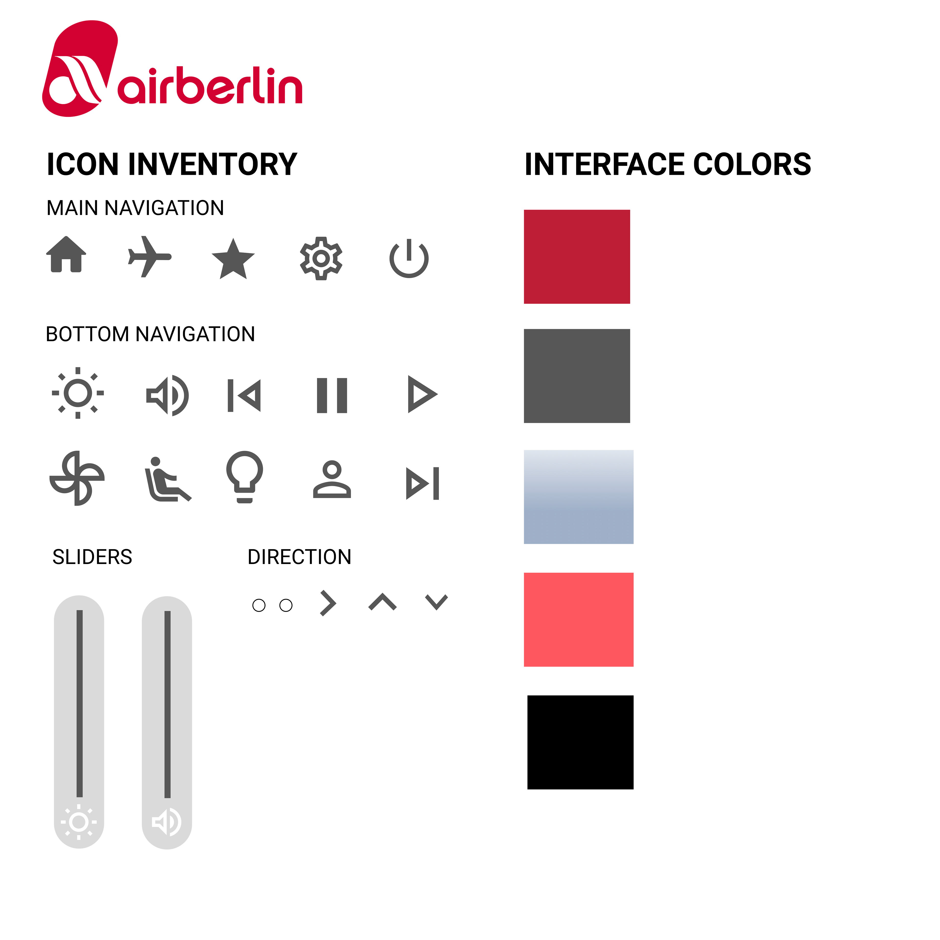
Visual Asset Inventory List
My interface colors are based off of AirBerlin’s brand colors. The sliders are similar to an iPhone’s volume and brightness controls, and are easy for users to understand. The small circles at the bottom of the screen indicate how many pages can be swiped through. When an arrow is present, it shows the user they can slide in that direction.
Wireframes
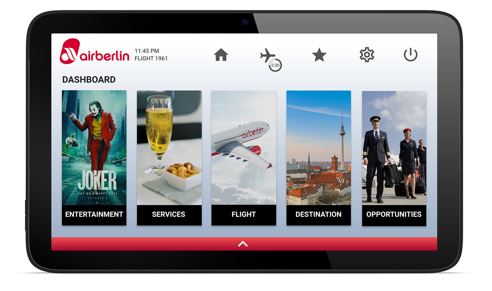
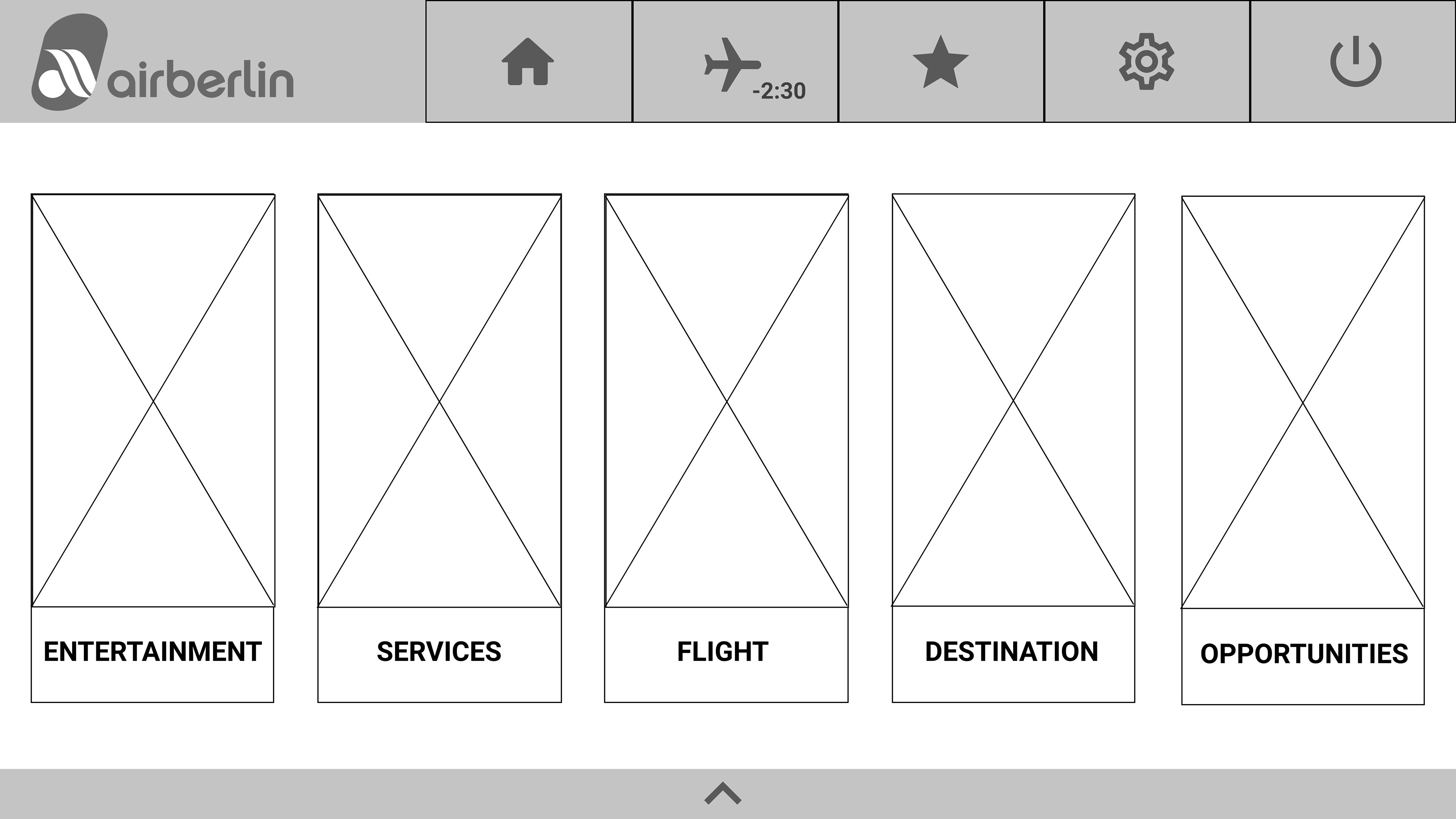
On figma, I created the Wireframes using my flowchart. The home screen offers five sections; Entertainment, Services, Flight, Destination, and Opportunities.
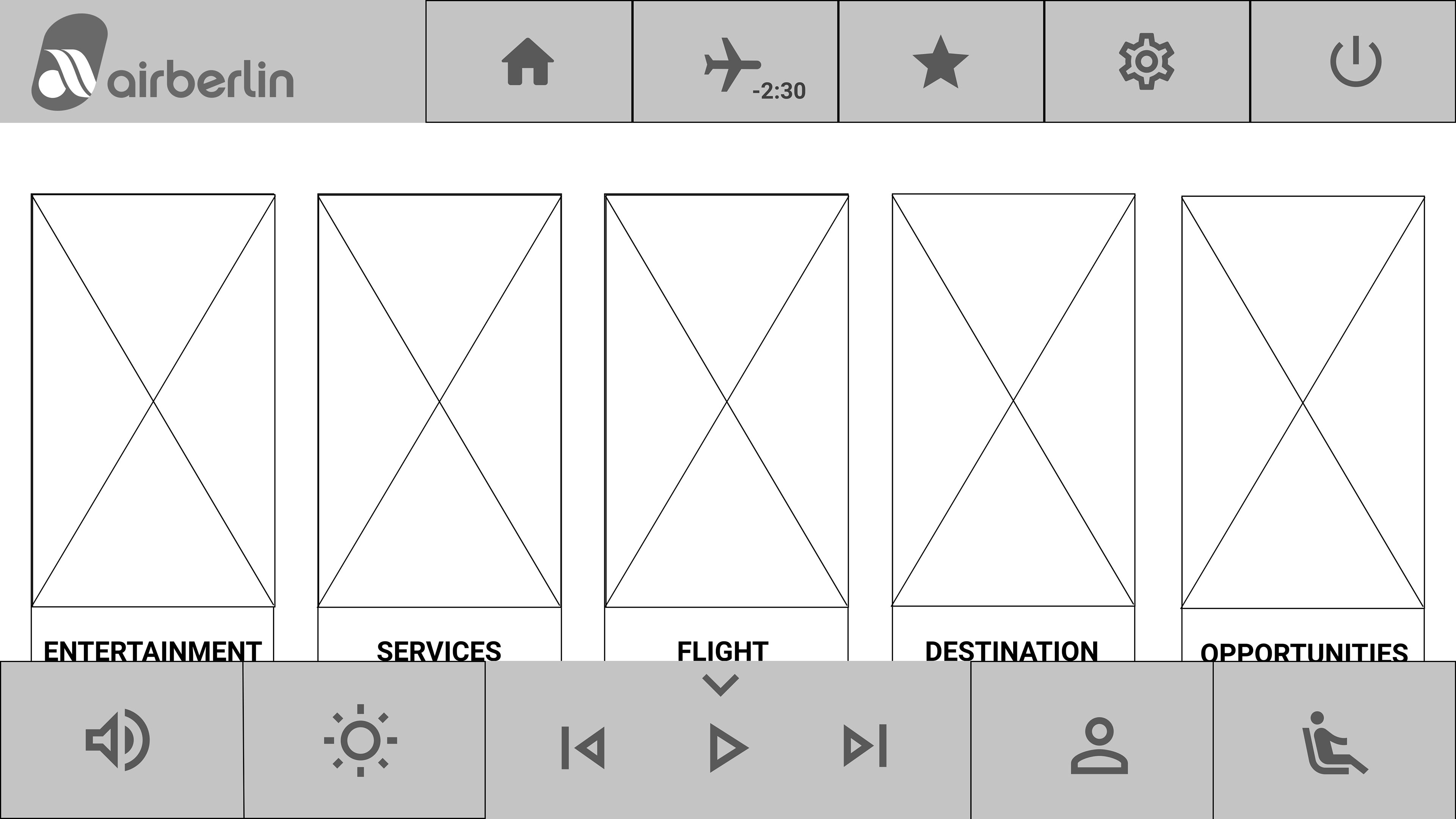
This wireframe is showing the bottom navigation. The user can call or chat the attendant, control the seat, brightness, and volume.
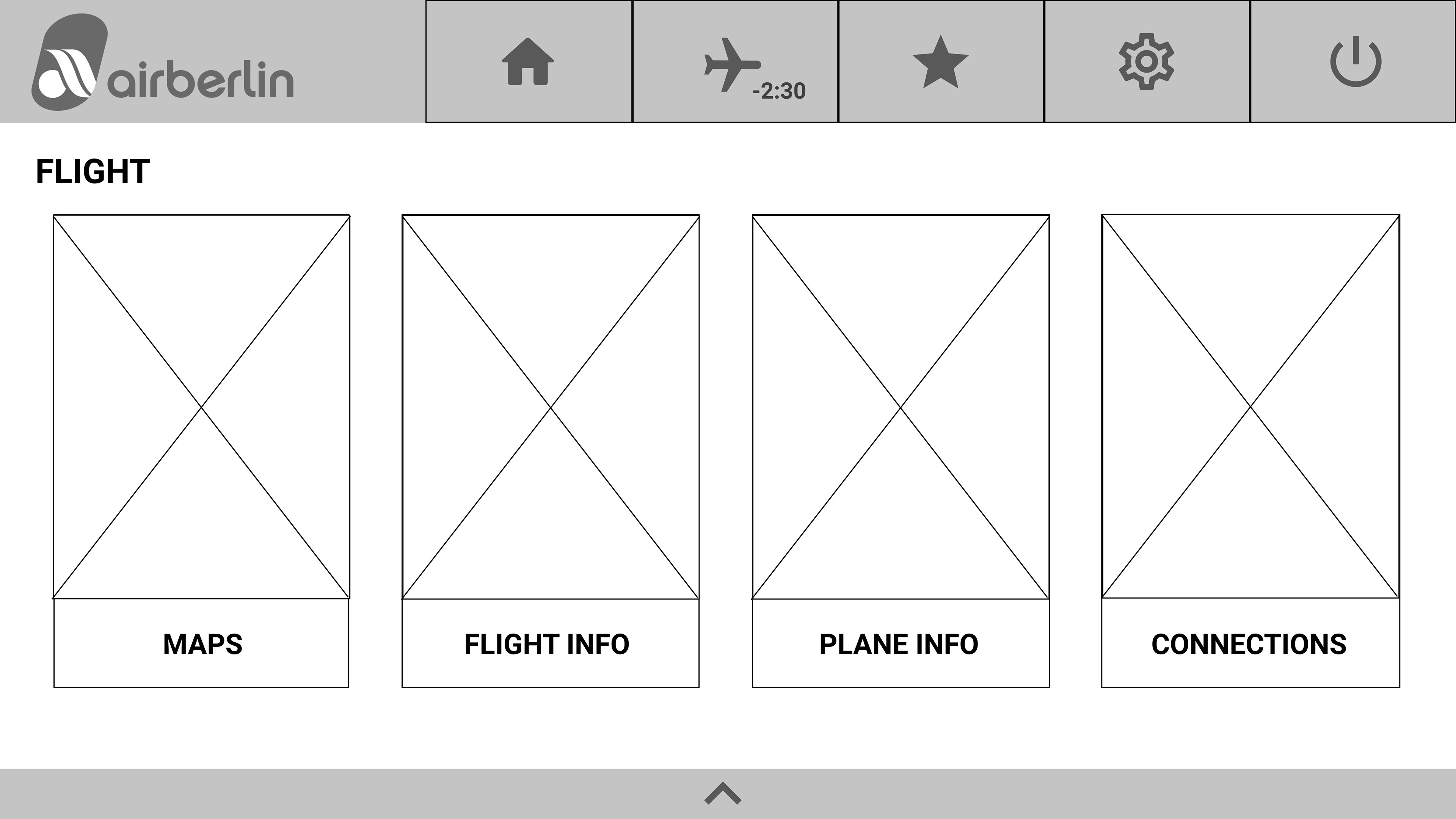
This is the flight information screen, with maps and information of the flight, plane, and connections.
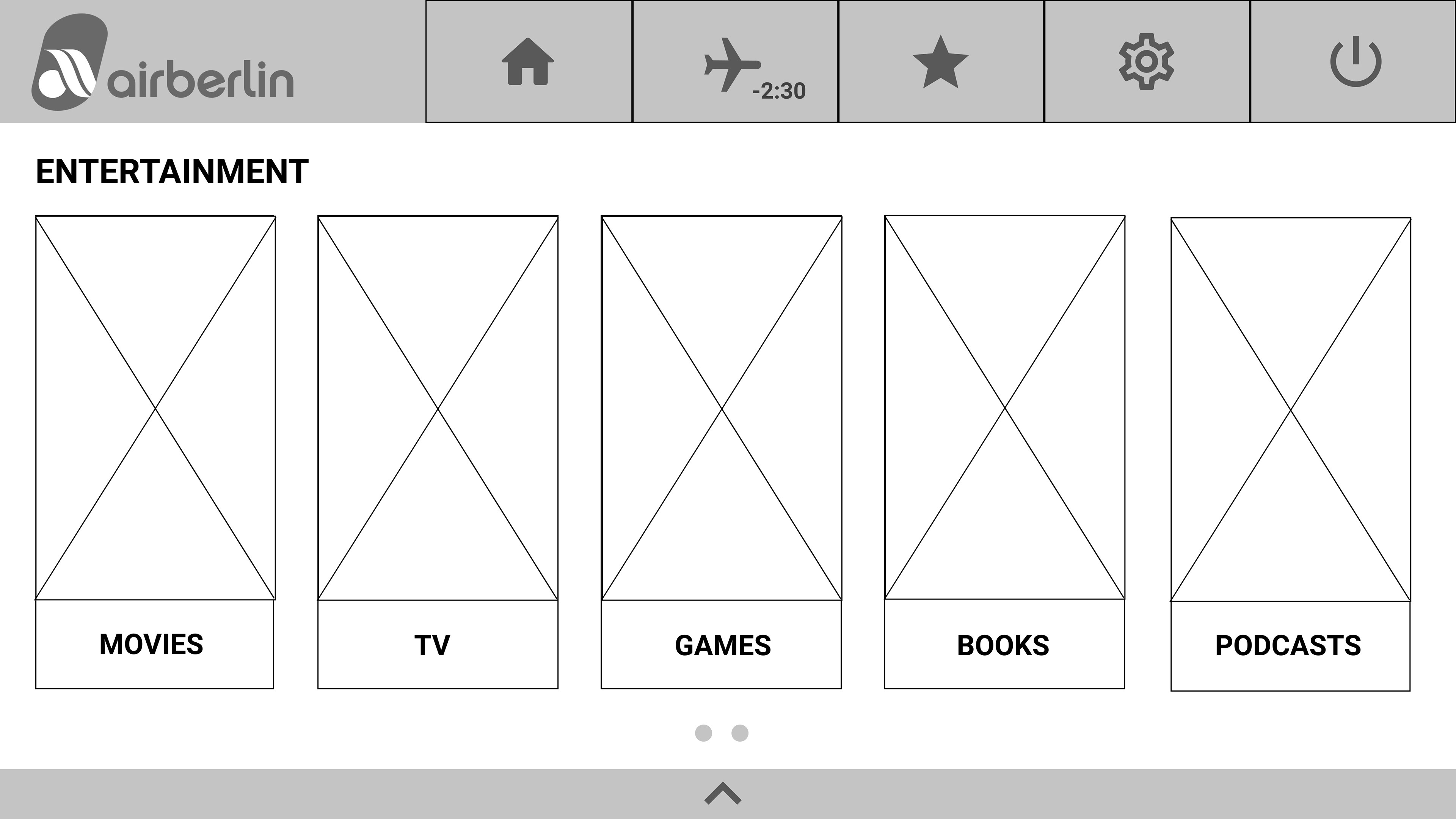
This is first screen you see when you click on entertainment, if you slide to the next screen the user can see music, news, chat, and social media buttons.
My Results
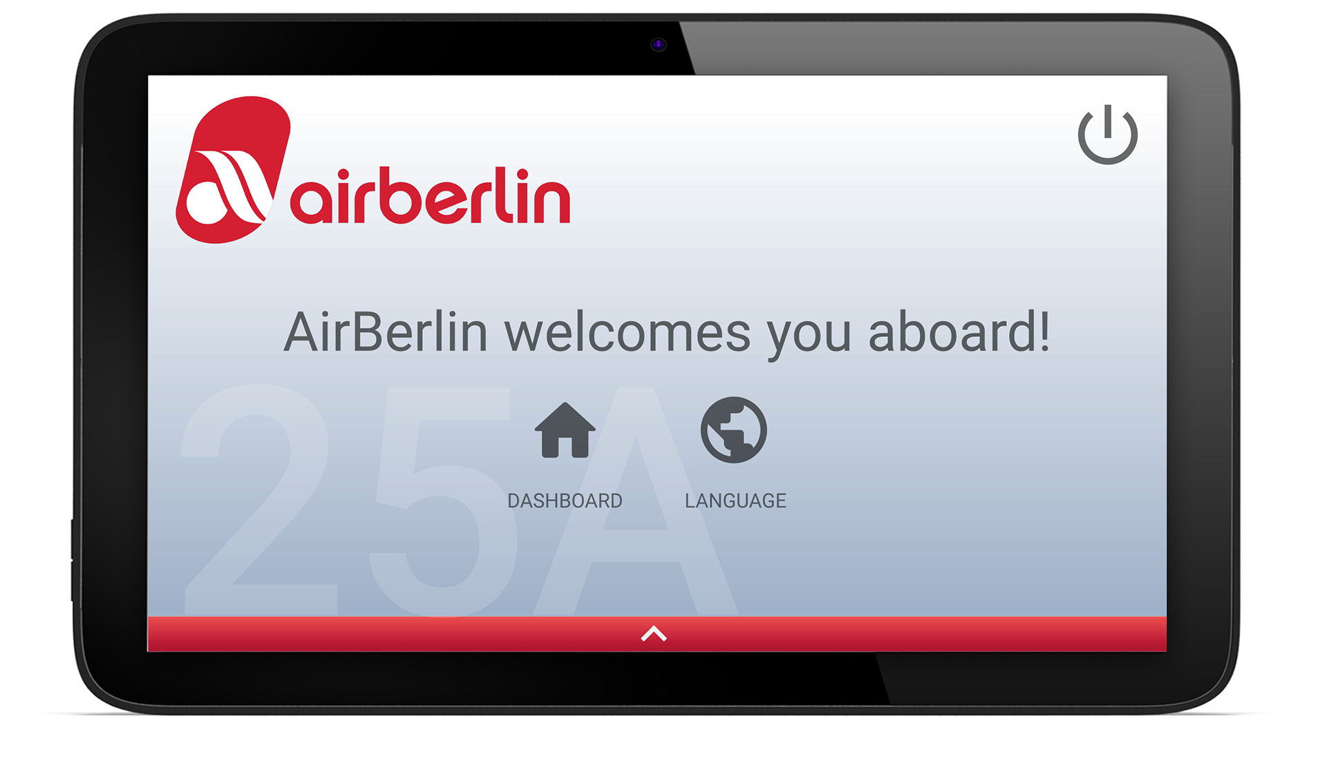
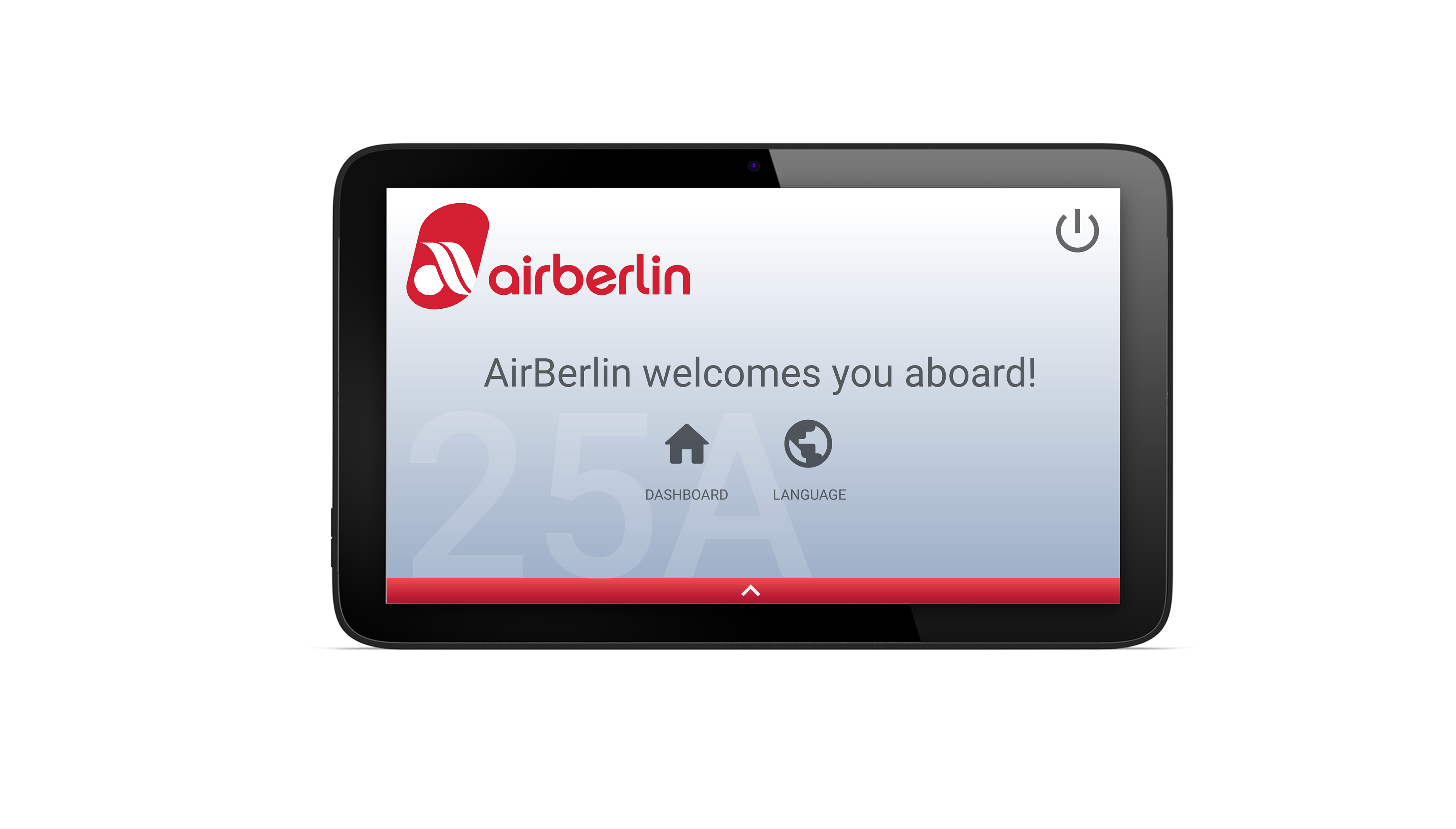
Home Screen
After pressing start, this is the first screen users see. Everything is categorized in these five sections.

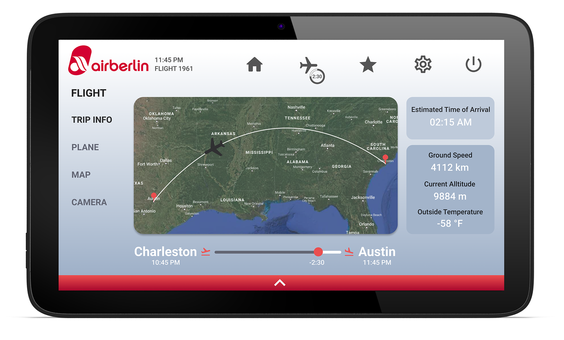
Flight Screen
The flight screen shows trip information and the map. This was the most difficult screen for me to design. I was unsure about all the information users would want to see on the main flight page.

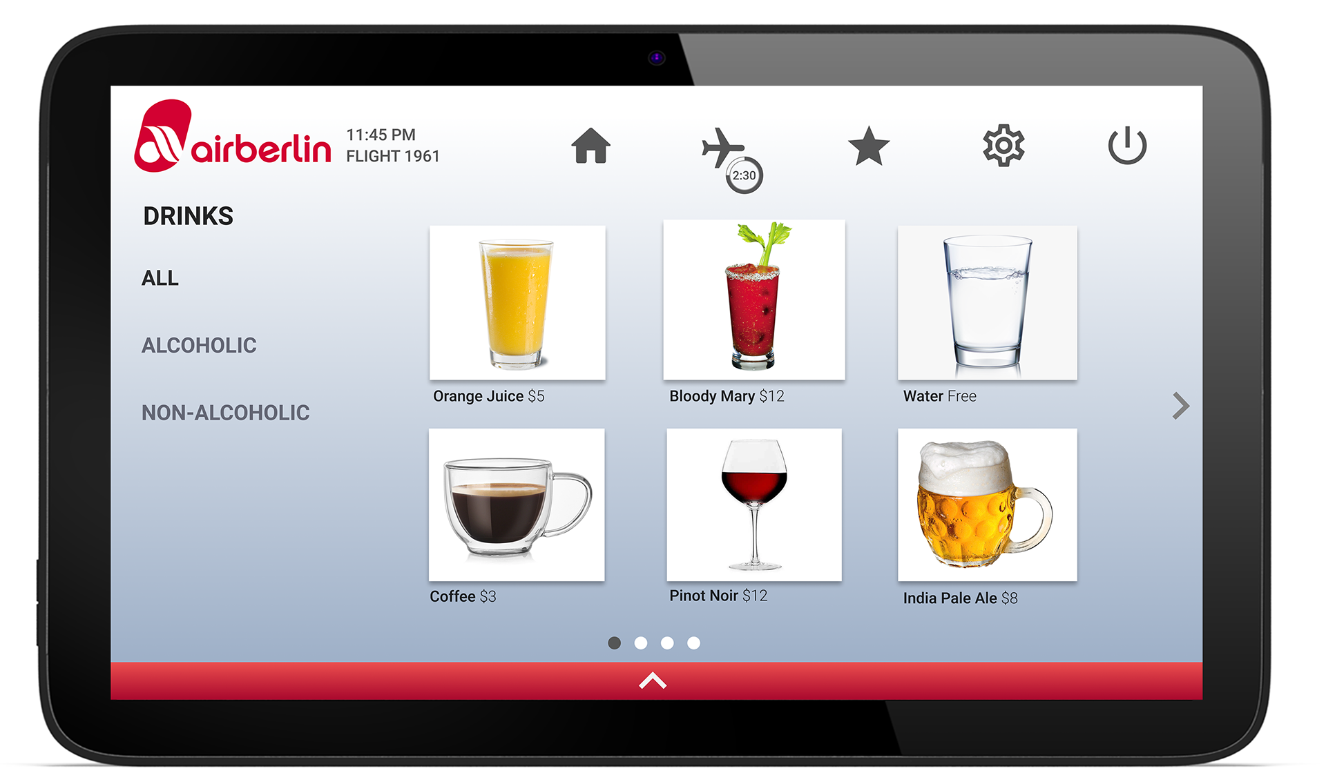
Drink Screen
Originally, I had the drinks and food in one section, but separating them made the screen much cleaner. Alcoholic and Non-alcoholic was the best way to categorize the drinks, I was considering hot vs cold but this is easier for the user to find what they are looking for.

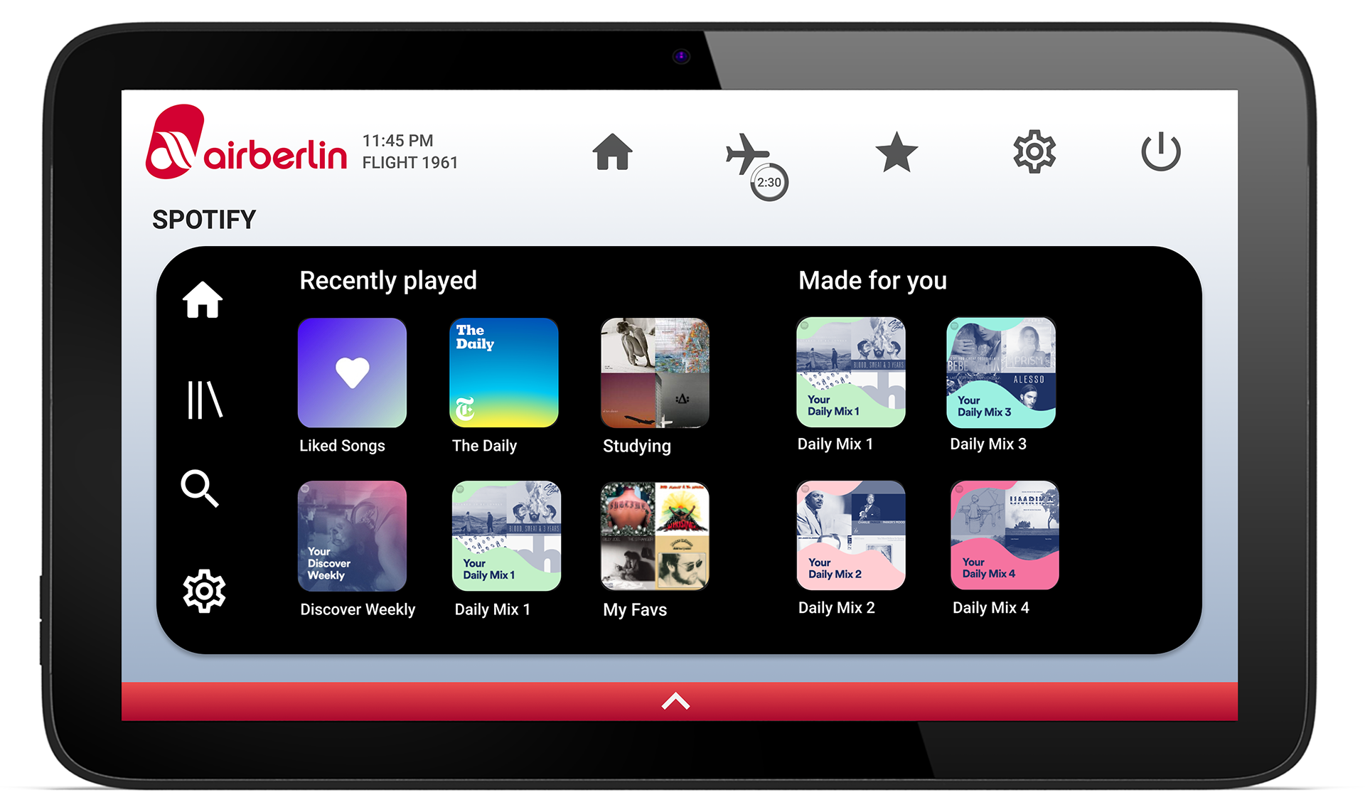
Spotify Screen
Spotify is my favorite feature. The user can choose between Apple Music or Spotify and log into their account. I designed this based off of the iPhone app, showing the users recently played and playlists made for them on the home screen. Music was the number 1 interest in my user survey, so I knew it would have to play an important part.

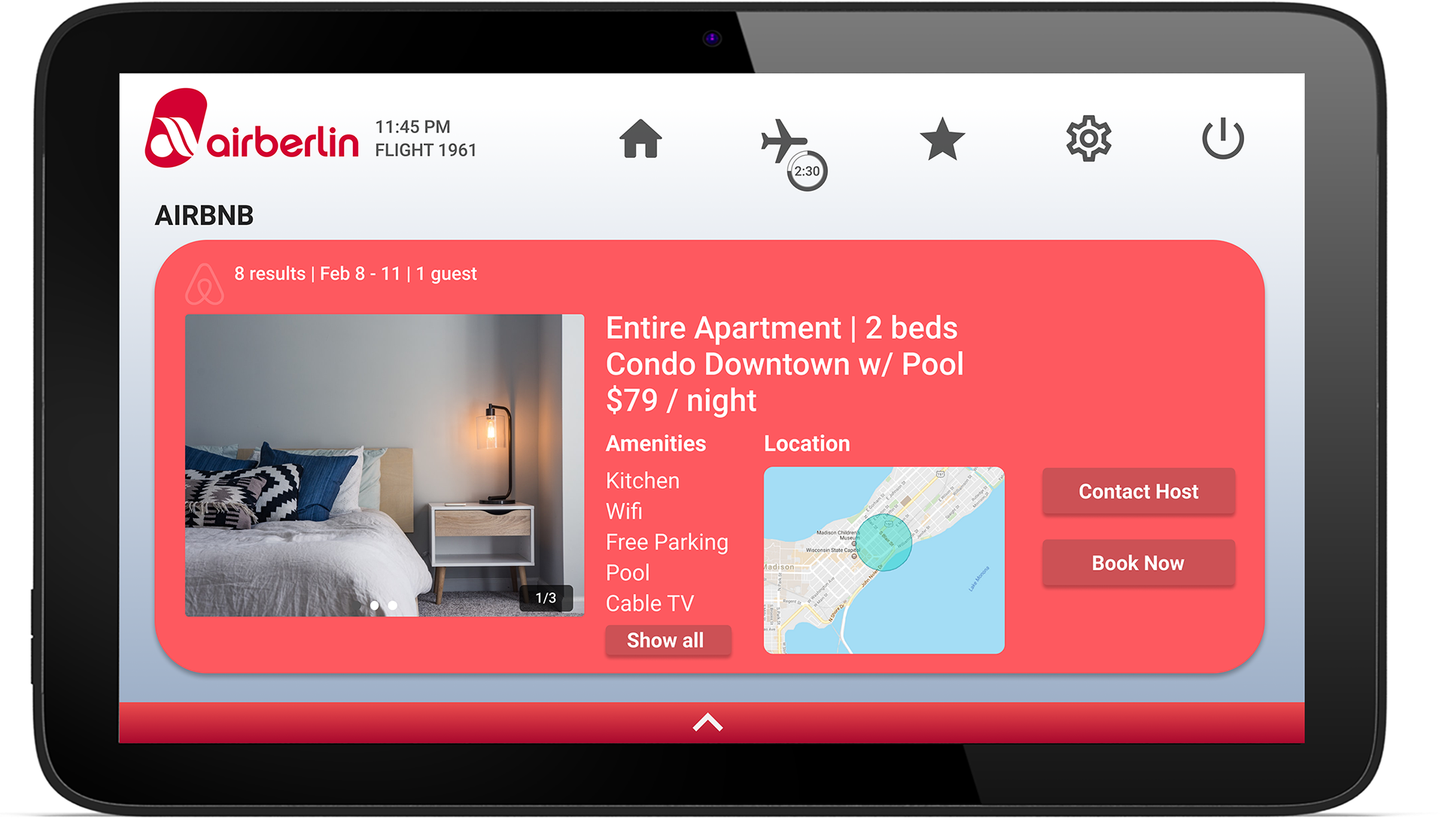
Airbnb Screen
Airbnb is a feature that is very important to Shannon, my user persona. Her travels can be very random, with no plan. Being able to book an Airbnb last minute would make her experience productive and memorable. The design is based off the Airbnb app, I simplified the page and only included what I thought was essential to booking the room.

Feature Overview
Prototype Video
Reflection
This was one of my first UX projects I went through without much guidance, being a fully online class at the beginning of COVID-19. Gathering research on other in-flight entertainment systems also proved to be very difficult, because those systems aren't available online. That being said, I am very proud of the amount of effort and time I put in to my research, no matter what my limitations were.
Looking back there are many things I would do differently. Firstly, I wish I had asked users what information is important to them on the flight screen. That question could have easily been included in my user survey, and would have helped greatly in designing my flight screen. This project did not require user testing, but I wish I conducted them for myself. Having users organize the system, using flashcards, would have been great insight on the best way to understand what the users need, instead on just basing it on my opinion and competitors systems. Lastly, even though the Airbnb feature was useful to my user persona, I don't know how useful is it to the majority of flyers. I assume most users have their accommodations worked out before they fly to their destination. Gathering user insights on if this feature is useful to them could have potentially save me the time I put into it if majority of users would bother with this feature.
This project was a great learning experience, working with a system that I couldn't access forced me to work in a way I never had to before. I am thankful for all the users that spent the time to respond to my survey and my professor for always offering helpful feedback and insights.