
For a rebranding project I created a new brand identity for the menstrual cup company Divacups. They, and most menstrual companies, rely on feminine styles and language, but people who menstruate that don't identify as a "woman" can feel alone, stigmatized, and discriminated against. I aimed to create an identity that includes all people who menstruate.
Brief
Take an already existing brand and reimagine it with a new brand identity.
Tools
Adobe Illustrator & Photostop
Timeline
4-week project
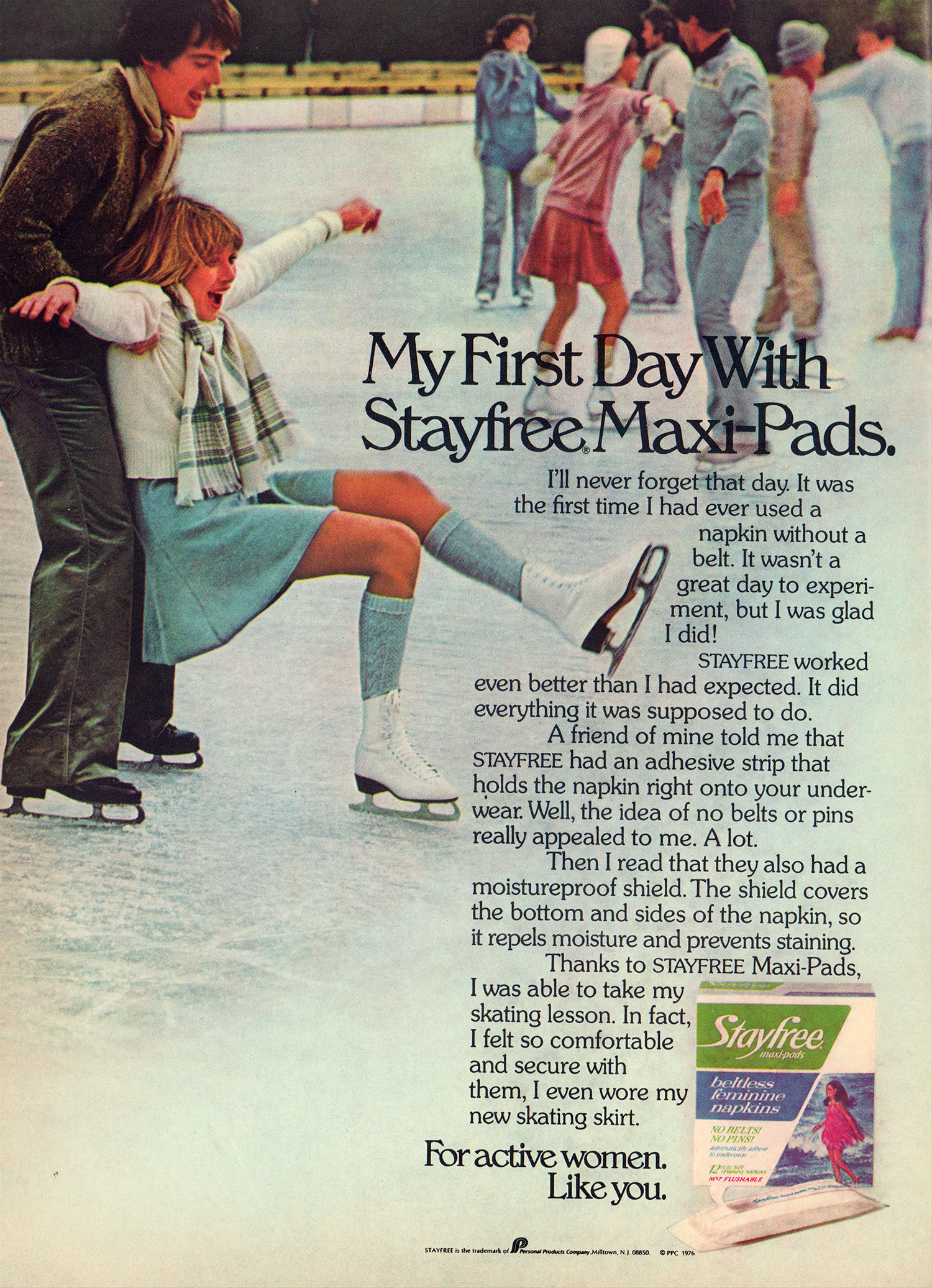
Anti Inspiration
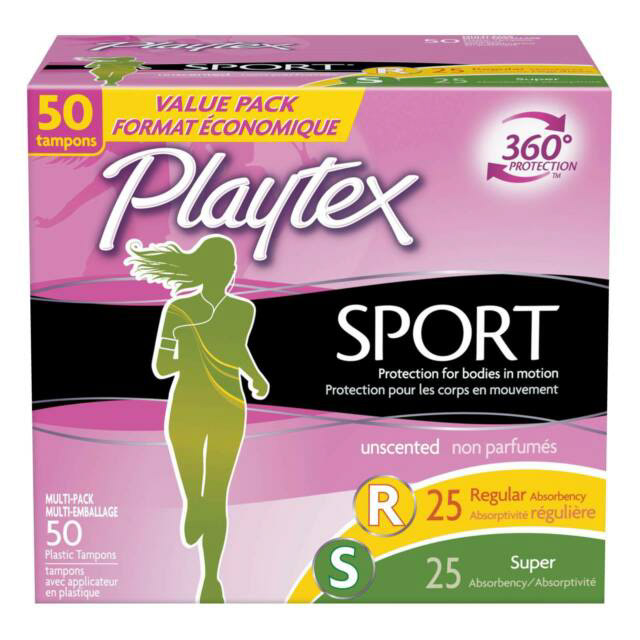
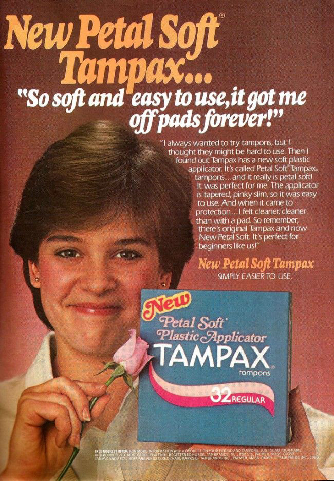
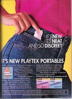
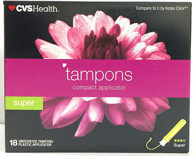
After researching menstrual brands and companies, it was difficult to find any brand creating inclusivity, it was much easier to find what I didn't want to do. Here are some examples of packaging and advertisements that use feminine langue and styles, or continue the idea that menstruation should be kept secret. A strange trend that can be seen is that people can't be active while on their periods, as seen in the "sport" edition on Playtex and in the Stayfree advertisement.
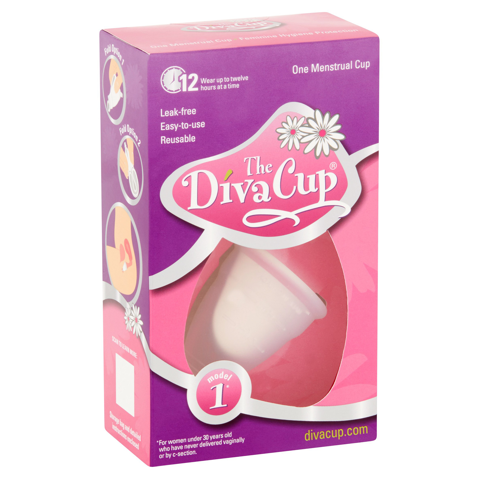
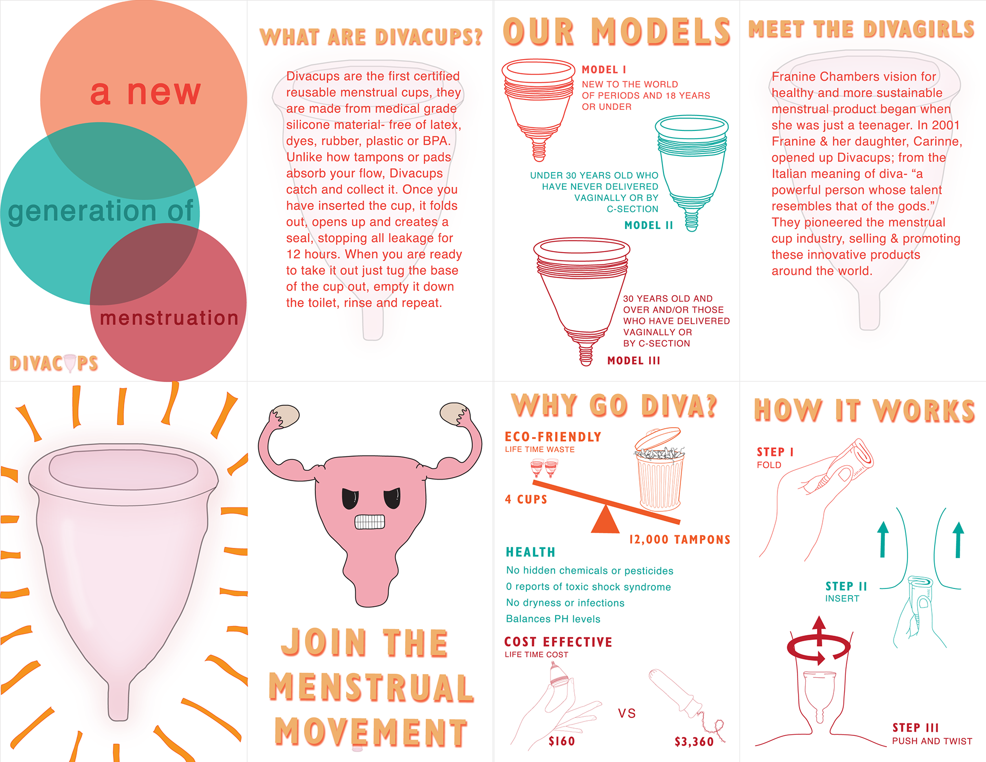
Divacup's packaging had the same issues, excluding people who menstruate by saying "*For women under 30 years old who have never delivered vaginally or by c-section" and using the typical styles of floral designs and pink and purple colors.
My Font & Color Choice
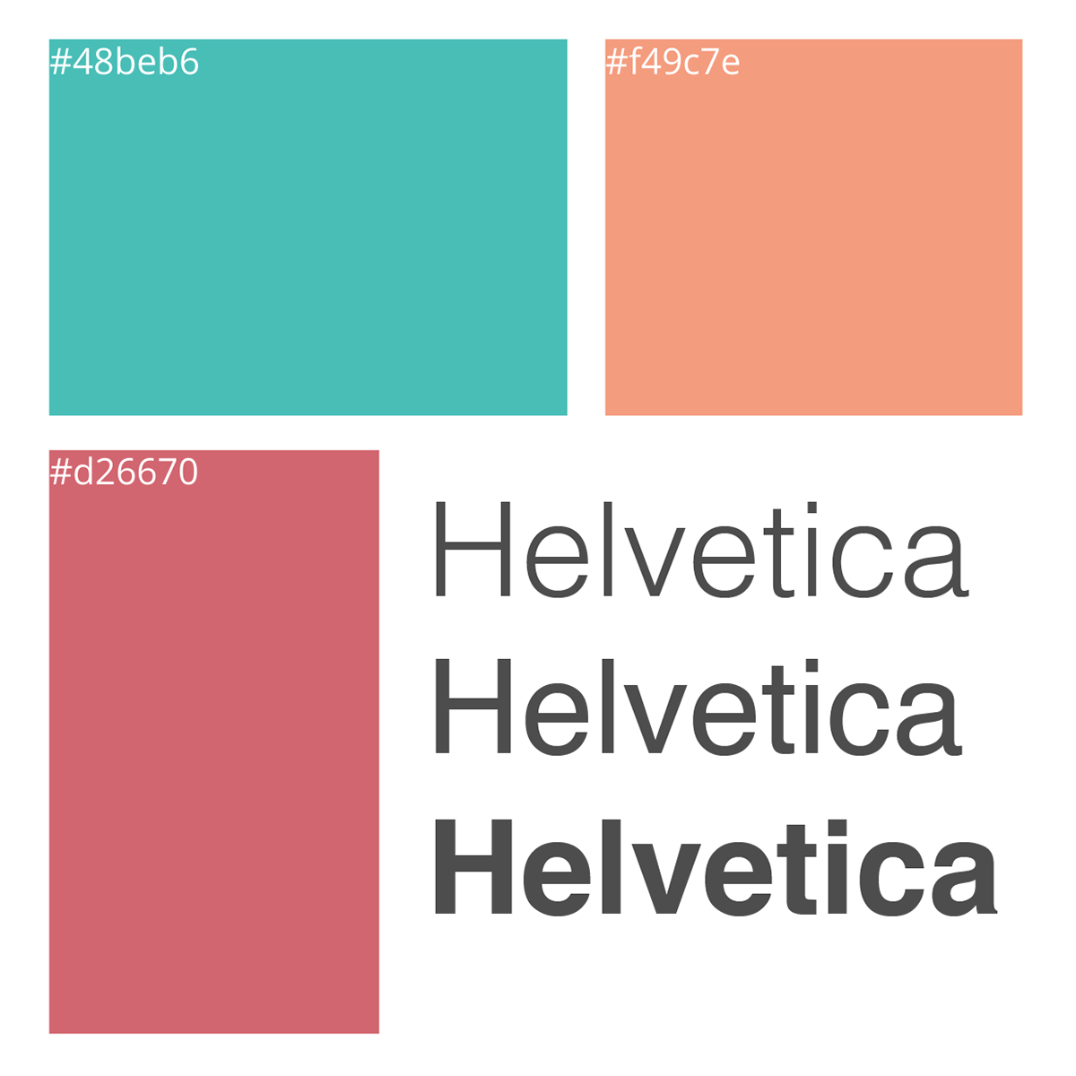
I decided to go with a light orange, turquoise, and a chestnut red. I found these colors pleasing together and I tie to any gendered stereotypes. Helvetica was the perfect font because of the directness, it gets straight to the point with out extra frills. If people are going to put a product inside their body, they should be able to get the information quickly.
About the Consumer
The 2018 stats on menstrual products says that liners and tampons sell far more that other products in the United States. Menstrual Cups have existed under the radar since 1937, but they are just recently getting noticed and used. I have seen a push against the cup in my community and in my research. A consumer who uses a menstrual cup may be more concerned with what they are putting in their body, and also want to live more sustainable life by putting less waste into our world.
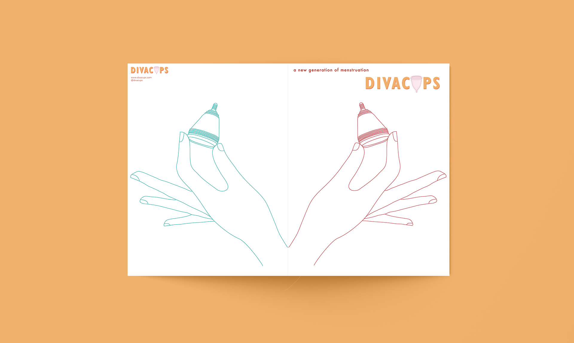
Logo Design
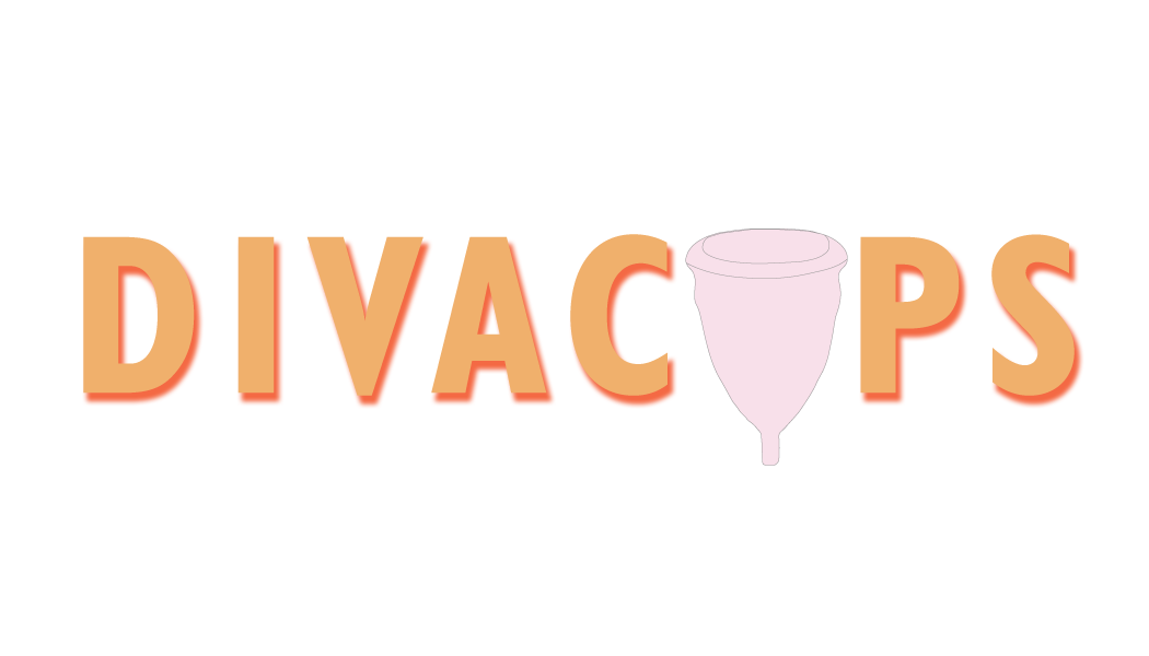
I wanted to show the actual look of the menstrual cups that Divacups sells, they are a pinkish color so I wanted the cup to stay true to that. I explored many different options in my sketches, some being with blood in the design or a drawing of a vagina. I decided to go with a more simple design that is still hold's the users attention, without the shock factor of blood or a vagina drawing.

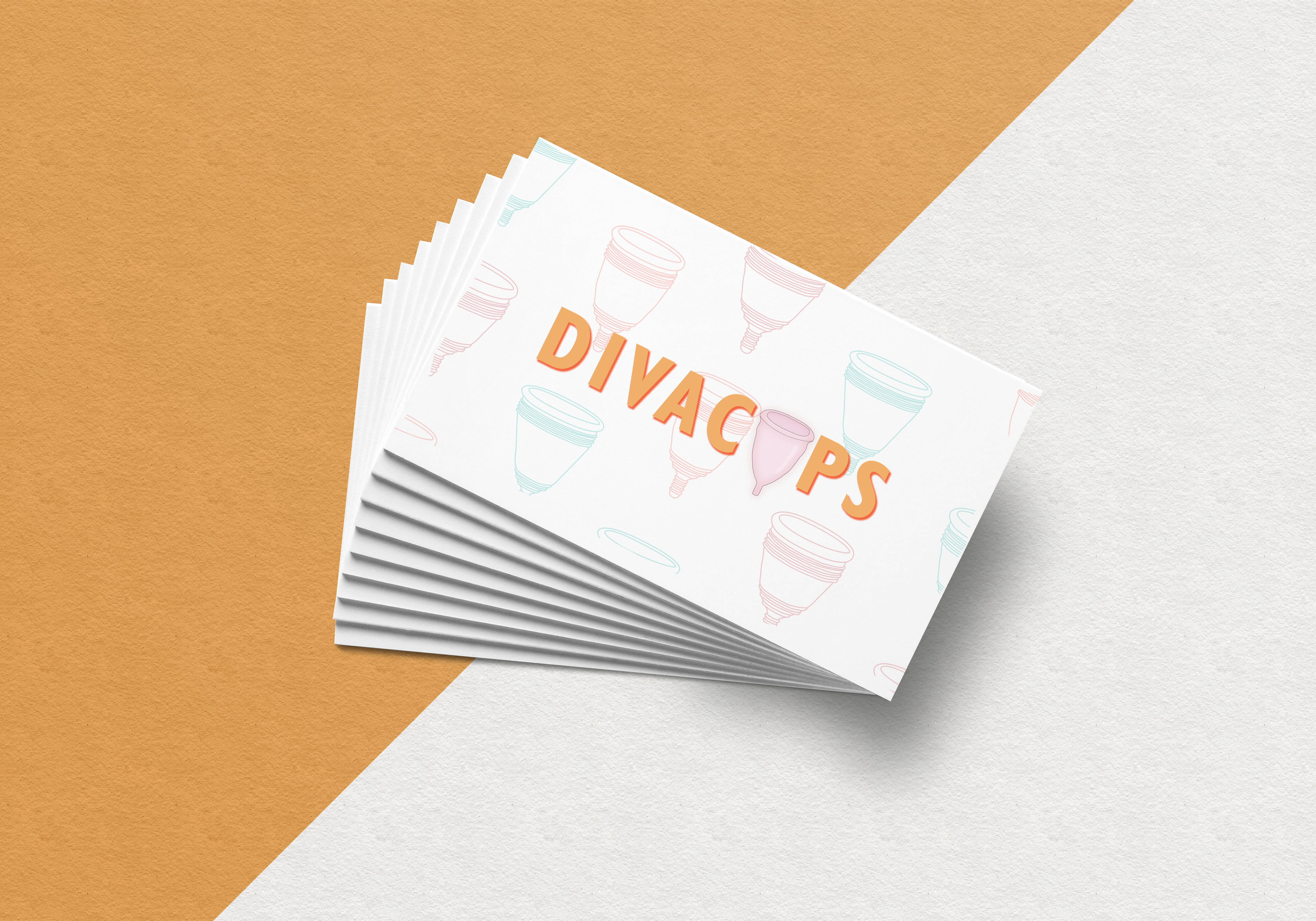
Business Card Design
I wanted to keep it simple but still artistic. There are 3 different types of cups that Divacups makes for different body types so I created outlines of each shape of cup and created a pattern to use throughout the brand.
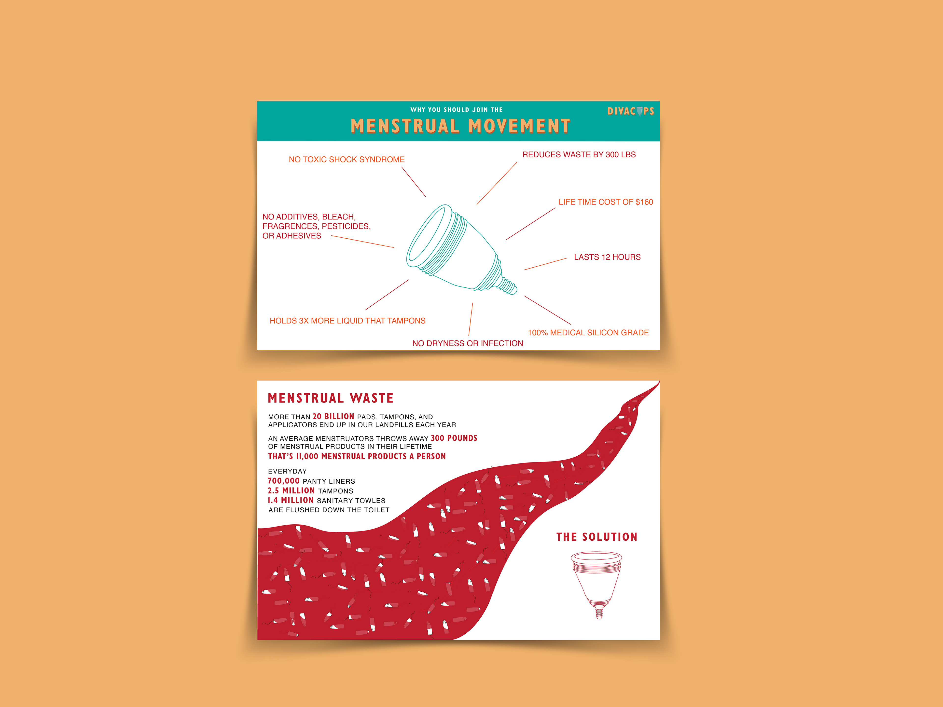
Professional Post Card Design
There are two main reasons I found that people prefer menstrual cups and thats to be more conscious of what they put in their bodies and to be more environmentally friendly. I also found that the cups biggest competitor are tampon companies. So for the post card I made one side all about the benefits of menstrual cups compared to tampons, many of those being health benefits. The other side it all about the environmental impact of tampons and how menstrual cups are the solution
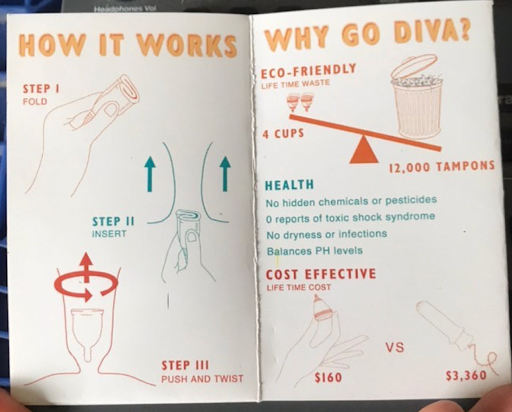
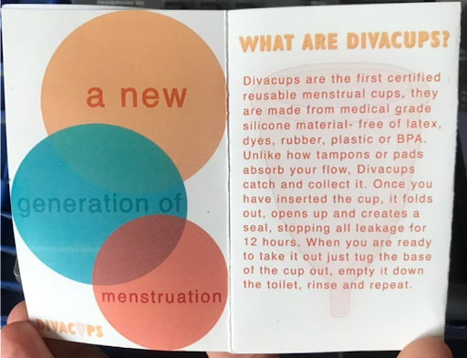
Pamphlet Design
This pamphlet comes with each Divacup and explains what the cup is and how to you the cup, the history of Divacups, and some of environment, health, and cost benefits.
Press Kit Design
I made the press kit simple but eye-catching, using the outlines of hands and menstrual cups from the other deliverables in the project to maintain a consistent redesign.
Refection
This is one of my first projects I did in design, and I'm so proud of it. The joy it brought me to discover a problem, one I was particularly interest in, and design a solution for it helped me find my passion— UX design. Although, one thing I wish I did differently in this project is solve for why users prefer tampons over menstrual cups despite the benefits. I could have solved to help inclusivity and also sustainability.
Three years after creating this projects, Divacups has actually redesigned their logo, packaging, and website design. Their redesign excludes the flower and exclusive language on their product packaging. Seeing these changes makes me hopeful that the menstrual industry is becoming inclusive to all people who menstruate.